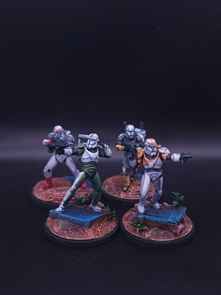
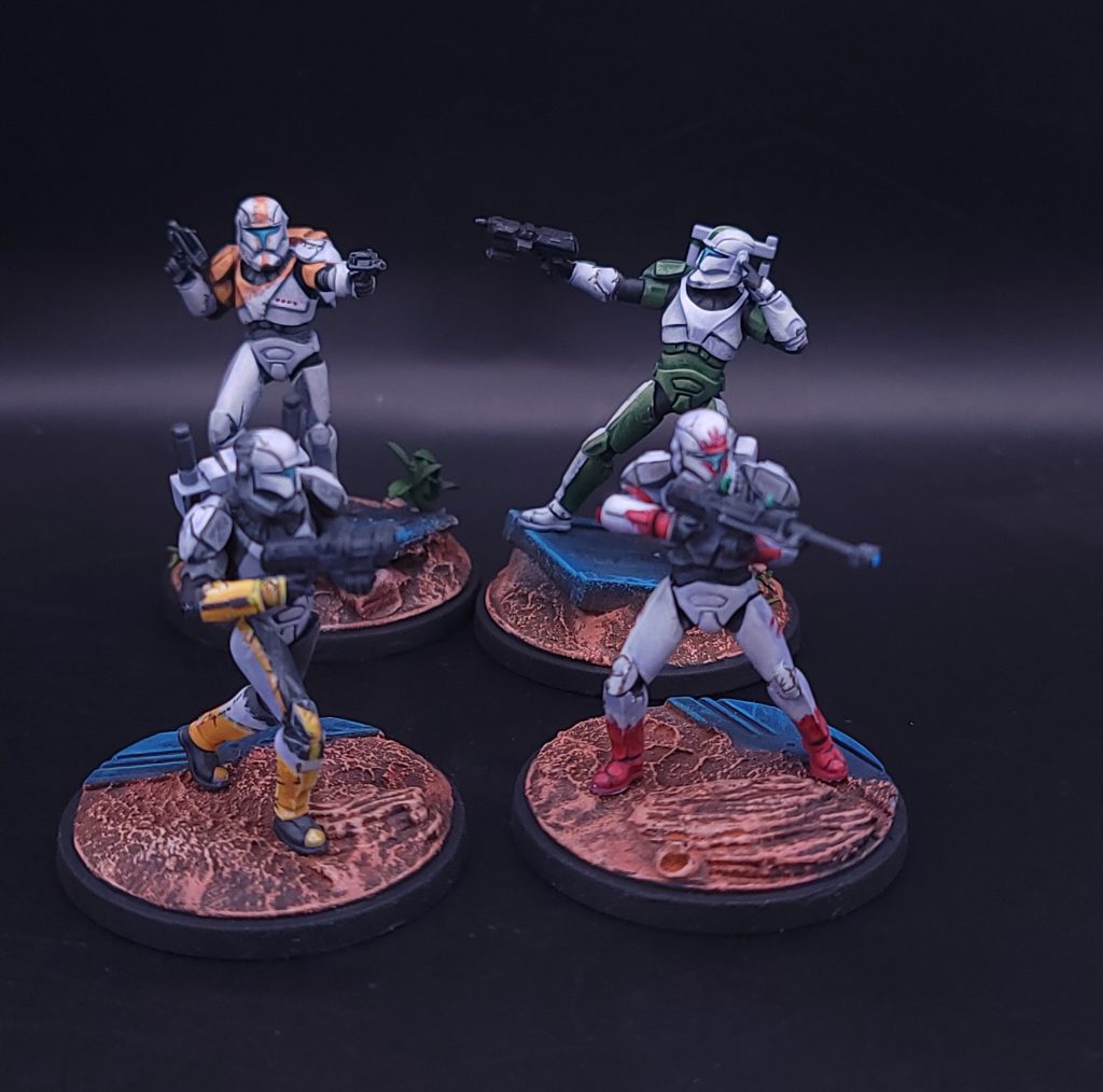
The Delta Squad Form Up pack brings the iconic Republic Commandos to Star Wars: Shatterpoint, complete with their distinctive armor markings from the classic video game. I’m a new writer for Goonhammer’s hobby circle, and I volunteered specifically for the Delta Squad box because I love painting both the color white and the unique stylized battle damage that characterizes the Clone Wars animated series. In this article, I’ll walk you through my approach to painting white armor, how to achieve a battle worn effect on Delta’s particular scheme, and easy tricks to elevate the stock Shatterpoint bases.
How to Paint White Clone Armor
Pure white on a miniature is an oft bemoaned scheme by hobbyists. Without an airbrush, getting smooth coats can require time and patience. Over my 10+ years in the tabletop gaming hobby, the biggest takeaway I’ve learned when painting is to not use white in the palette. Instead, use colors that are close to white, and layer in effects to build up the brightness and highlights.
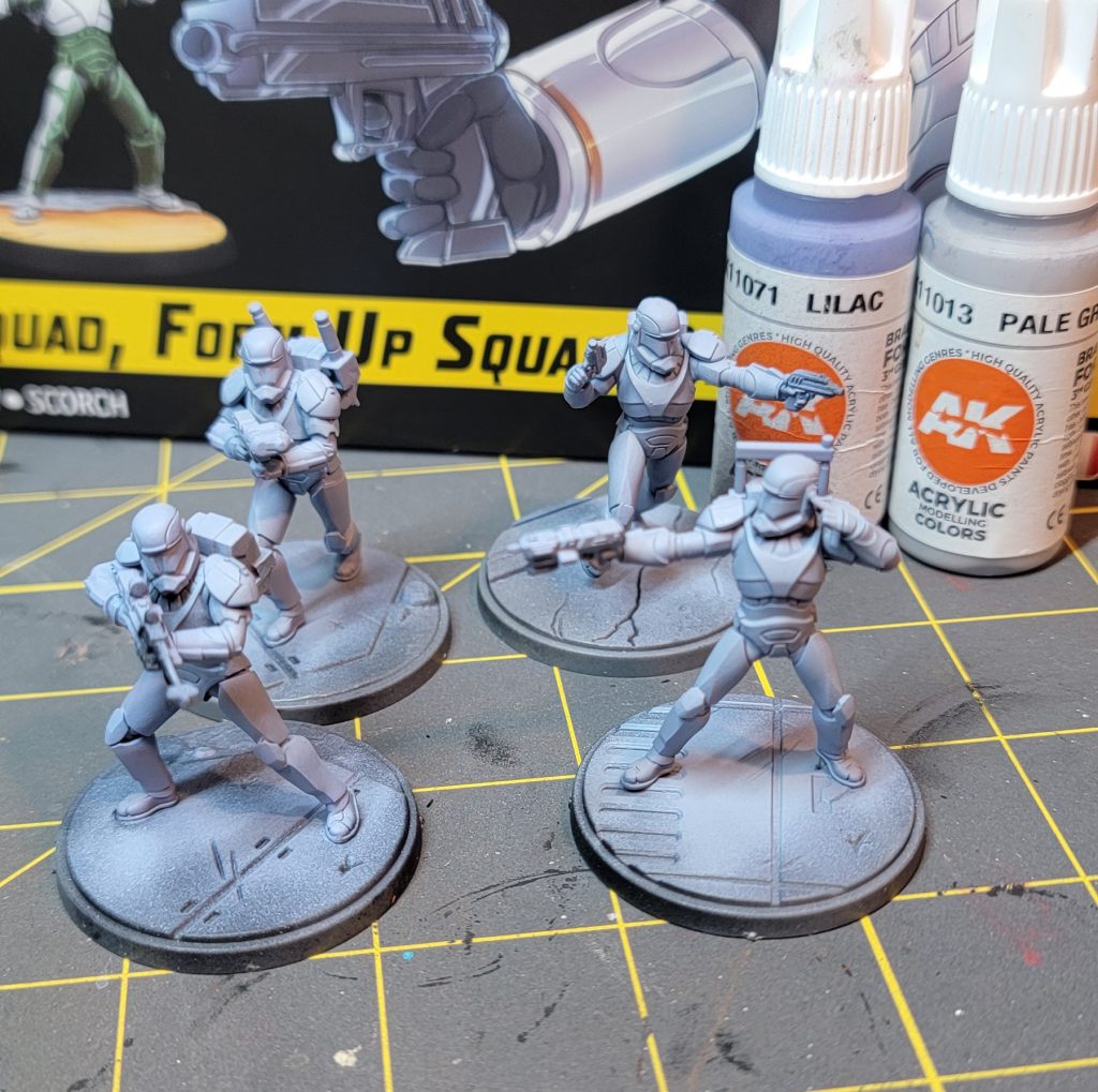
For clone armor, we want to start with a color that is close to our midtone. We will build up from this midtone to our brightest highlights and then glaze down for deeper shadows. I started with priming using the Army Painter Matte Black primer , and then applied a base coat with a 50/50 mix of AK Interactive’s Lilac and Pale Grey through an airbrush. This color combination gives a cool undertone to contrast the relatively warm colors of the squad markings. If you do not have an airbrush, I would recommend priming in a color close to a cool grey, such as the Citadel Grey Seer.
Before defining any of the shapes of the armor, I want to paint the lenses of the helmet. This can be painted at the end, but because we are going to be layering and building up color, it will be much easier to fix now if we get paint outside the lense. For the lenses, I am starting with Monument Hobbies Coal Black to define the outline between the helmet and the lense. Once that is dried, we will add Monument Hobbies Turquoise. Add increasing amounts of AK Interactive’s Ice Yellow to create the brightest spot in the middle of the lense.
With the lenses done, I want to define the black parts of the armor. Like before, it’s usually best to do this before we spend time refining our clone armor in case we mess up the lines. You can push the highlights of these black sections by mixing in small amounts of the AK Interactive Lilac to add highlights.
Moving onto the white armor, I specially chose the AK Interactive Acrylic colors line because they have a high saturation of color that performs well when thinned down with water. As many others have said before me, thinning paints is essential for layering color schemes in miniature painting. The AK Interactive white-ish colors will dry somewhat translucent when thinned, which will help us smoothly layer.
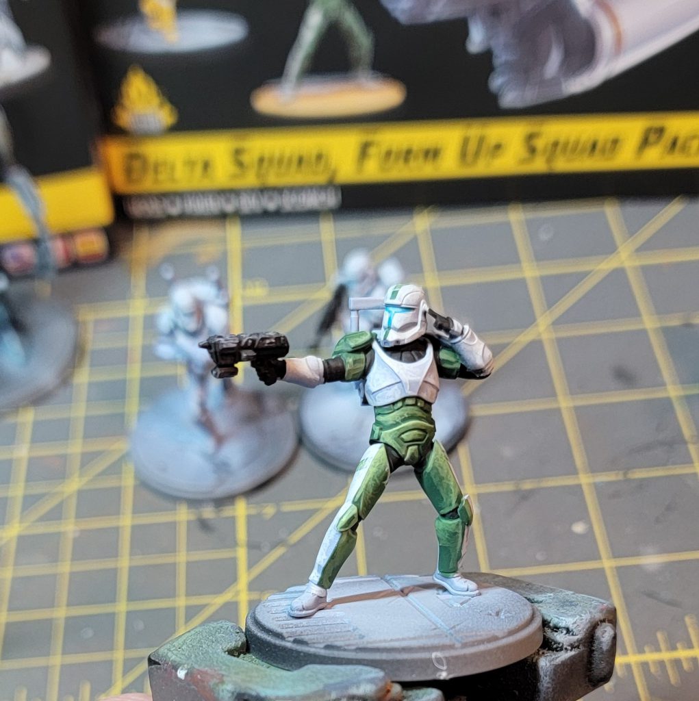
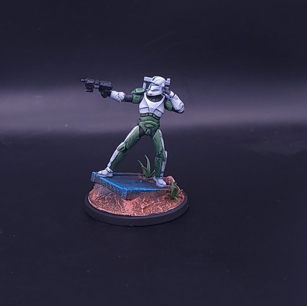
Using the same AK Interactive Lilac and the AK Interactive Pale Grey, create a mixture that is 25% Lilac and 75% Pale Grey . For this step, I am deciding where I want to define the volumes for each model. In the Work -in-Progress picture for “Fixer”, you can see that I’ve defined the central chest piece into the large “V” shaped section, the upper pectoral section, and the lower ribcage section. The highlights are generally in the same direction (upper left of the photo). I want the shadows for each section to lie next to the highlights of the next section to define the volumes.
To achieve that iconic “scratchiness” that we see on the videogame, the Clone Wars animated series, and the Bad Batch show, we are going to paint small lines or scratches that coalesce into brightest point of the volume we previously defined. I’m using a Raphael 8404 Size 1 brush. This brush has a sharp tip for creating the scratches, but also a large body for glazing and blending. To help sell the illusion of highlights and shadows, the lines should generally all end in the same area and have the same direction. We will continue to build up layers by adding increasing amounts of the AK Interactive Pale Grey. When adding the new layer of scratches, we want to leave some of the previous layer to create a gradient. The number of layers here will depend on your patience and how much you want to push the highlights. Once you get to a pure Pale Grey later, I recommend pushing the highlight one step further. When the model is out on the table and not under your painting lamp, that extra layer of brightness will help it pop! Create a final layer that uses a 50/50 mix of Pale Grey and AK Interactive Ivory. The Ivory brings in a hint of warmth to your brightest highlight.
To finish the white armor, you can decide if you like the current contrast between your base coat from earlier and your layers. If you want a bit more contrast , thin the Lilac to a glaze and glaze your shadows, remembering to end your brush where you want the color to be the strongest in a glaze. This process can also be used with your midtone to help smooth our some of the layers.
Boss
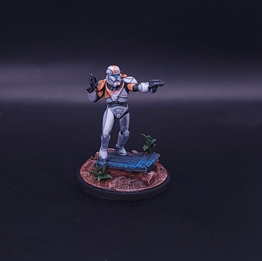
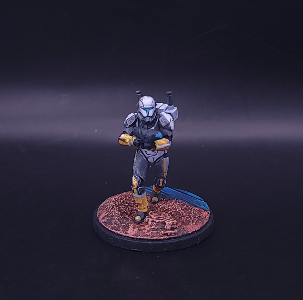
For Boss’s orange armor, I am starting with AK Interactive’s Light Brown and defining the pattern for the base coat. Don’t fret about having perfectly straight lines. We are going to use a technique to fix any wiggles in your pattern’s shape. Like our technique for white armor, we will layer in increasing amounts of AK Interactive’s Medium Orange with the Light Brown to create volume. Because this is part of the armor, our highlights for the orange should match up with the highlights we placed on the white armor. To push the highlights further, we can use the AK Interactive Sand Yellow mixed with Medium Orange in our brightest areas (top of helmet and chest in my example).
With the layered orange finished, we want to add some chipping effects . These will help blur the line between our white armor and the colored pattern and give a more realistic wear effect. More importantly, this can be used to clean up areas where our lines might not be perfectly straight. Using the Ivory + Pale Grey mixture from the white armor, we are going to create fine scratches that start in the white and go into the orange paint. This is most noticeable on Boss’s helmet and chest piece. The line starting in the white should be hardly visible. Repeating this in various sections across the edge of the pattern and varying the length of these scratches will give a “worn” look to the armor. We can further increase the battle damage look of the armor by adding small scratches to raised edges using AK Interactive’s Grim Brown.
Fixer
Fixer’s green pattern will follow the same technique as before for defining volume and layering. The base color started as AK Interactive’s Medium Olive Green, and added increasing amounts of AK Interactive’s Sand Yellow. Using the Sand Yellow helps unify the color schemes between all four models.
Sev
Like Fixer and Boss before, Sev’s color scheme will follow the same techniques we’ve already established. The difficulty with Sev will be the thin pattern on the helmet. When working with thin freehand lines, make sure you have a brush with a good tip and paint that is slightly thinned. The brush does not need to be an extremely small, 00 size , but it should be able to come to a clean point when loaded. We want the paint to have good flow from being thinned, but not too thin to require multiple coats for the face pattern.
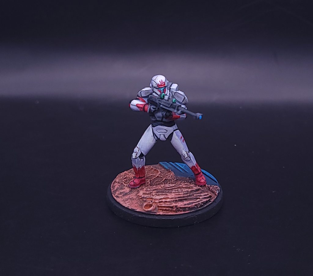
Scorch
Scorch’s armor is mostly a dark grey instead of white. However, I still recommend starting with the white armor technique that we defined earlier. The yellow sections will apply better and brighter over white than a grey starting point. For the yellow, I used AK Interactive’s Deep Yellow mixed with Light Brown. The Deep Yellow is too bright for the shadows, and the Light Brown will add some neutral tones to this area. Layer in the Deep Yellow and increasing amounts of Sand Yellow for the lights. The dark grey section of the armor starts with AK Interactive’s Graphite, and blends in with ivory for the highlights.
Basing
I’m using the standard Shatterpoint bases, but I’m adding bits to help each model feel unique on the table. All of my Shatterpoint bases use bits of rocks, plants, and debris. For Boss and Fixer, I wanted to add something extra to the battlefield. Note that I am painting my models and my bases separately. You can attach the models to your base using a small dot of super glue for the painting process. When you’re ready for basing, use a sharp hobby knife and carefully remove the model from the base.
Using leftover bits from the Corebox terrain, I cut up a piece of gantry and a wall to act as debris. I help create the look of being a part of the battlefield but using Milliput to form around the debris. For sev and scorch, I’m leaving the deck plating untouched, but adding some rocks and using Milliput to fill the gap between the stock base and the added features.
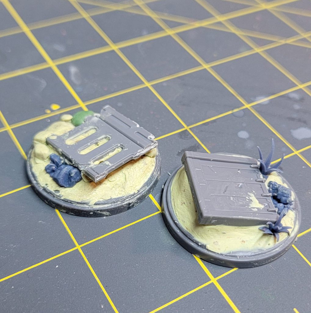
Once the Milliput dries, I prime everything black. I will build up the color of the base using a large, round dry bush. Starting from Vallejo Model Color English uniform, and making my way through AK Interactive Medium Rust, Vallejo Andrea Skin, AK Interactive Sunny Skin Tone, and finally Ivory. With drybrushing, I will mix each subsequent color in a metal palete, which helps mix and blend between the steps. Once dried, I use a combination of Vallejo brown and rust pigments. When working with pigments, you need a clean large brush to roughly apply them to a completely dried base. Then, follow up by applying a setting agent like Mineral Spirits to the entire area. The mineral spirits will take a few hours to completely dry, but once dried, the effect is that your pigments will create a unified wash type effect. Some pigments will have settled into recesses and will appear to create a dry, dusty effect.
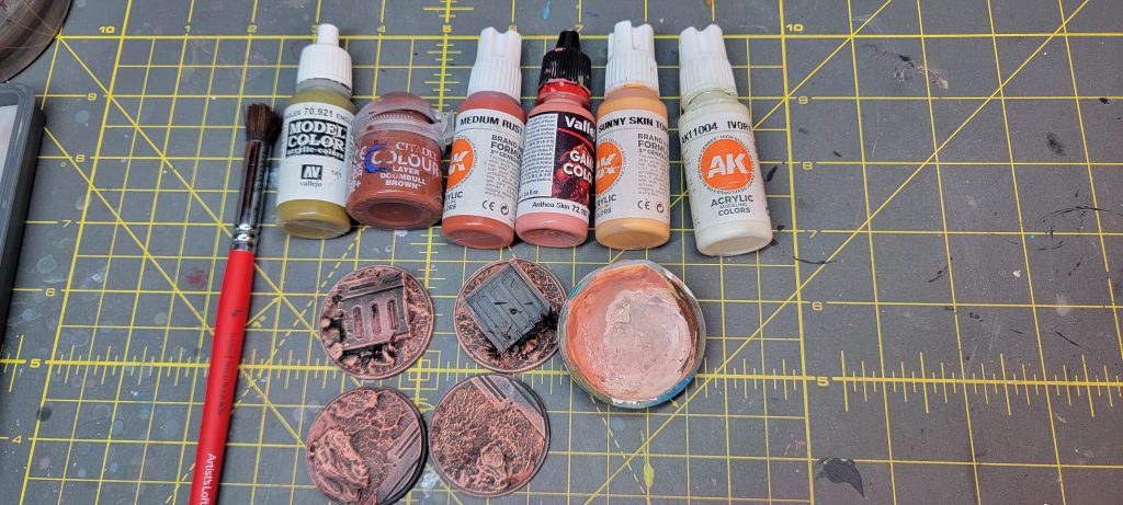
For the deck plating, I’m choosing a deep blue to really pop against the earthy tones. Once again dry brushing, we are going to start from a deep blue and work our way to a royal blue. My palette included Scale 75’s Deep Blue, Scale 75’s Cantabric Blue, and Scale 75’s Mediterranean Blue.
Once dried, we can add some greenery through bits or tufts. Finally, we will finish the rim with a thinned black to further define the model from the battlefield.
Wrapping Up
With practice, I’ve found that the “sketch and glaze” technique that we’ve outlined here is an effective approach that creates a unique style for Shatterpoint models. This process helps you define stylized volumes and highlights on colors that might be difficult . If you want to see more examples of this style of painting, I recommend checking out YouTube videos by painters that focus on non-metallic metal, such as Jose Davinci and Angel GiraldeZ. There are also other fantastic hobby articles within Goonhammer for other techniques approaching white armor. No matter how you decided to approach this box, there’s no doubt that the Delta Squad is making a huge impact on the gaming aspect of Shatterpoint.
Have any questions or feedback? Drop us a note in the comments below or email us at contact@goonhammer.com. Want articles like this linked in your inbox every Monday morning? Sign up for our newsletter. And don't forget that you can support us on Patreon for backer rewards like early video content, Administratum access, an ad-free experience on our website and more.Thank you for being a friend.


 Goonhammer App and Patron Updates: April, 2026
 Kill Team Tournament Report: Engage, Party, Repeat's March Madness 2026
 Goonhammer Reviews: Tribal Conquest