Painting | How To Paint Everything | Hobby
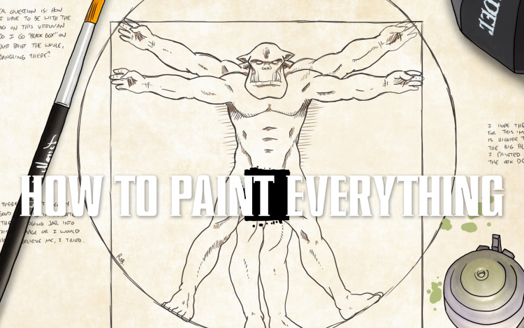
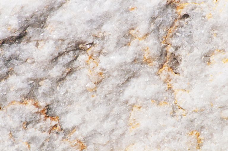 Unpolished marble. Credit: Joelle Icard, Getty Images
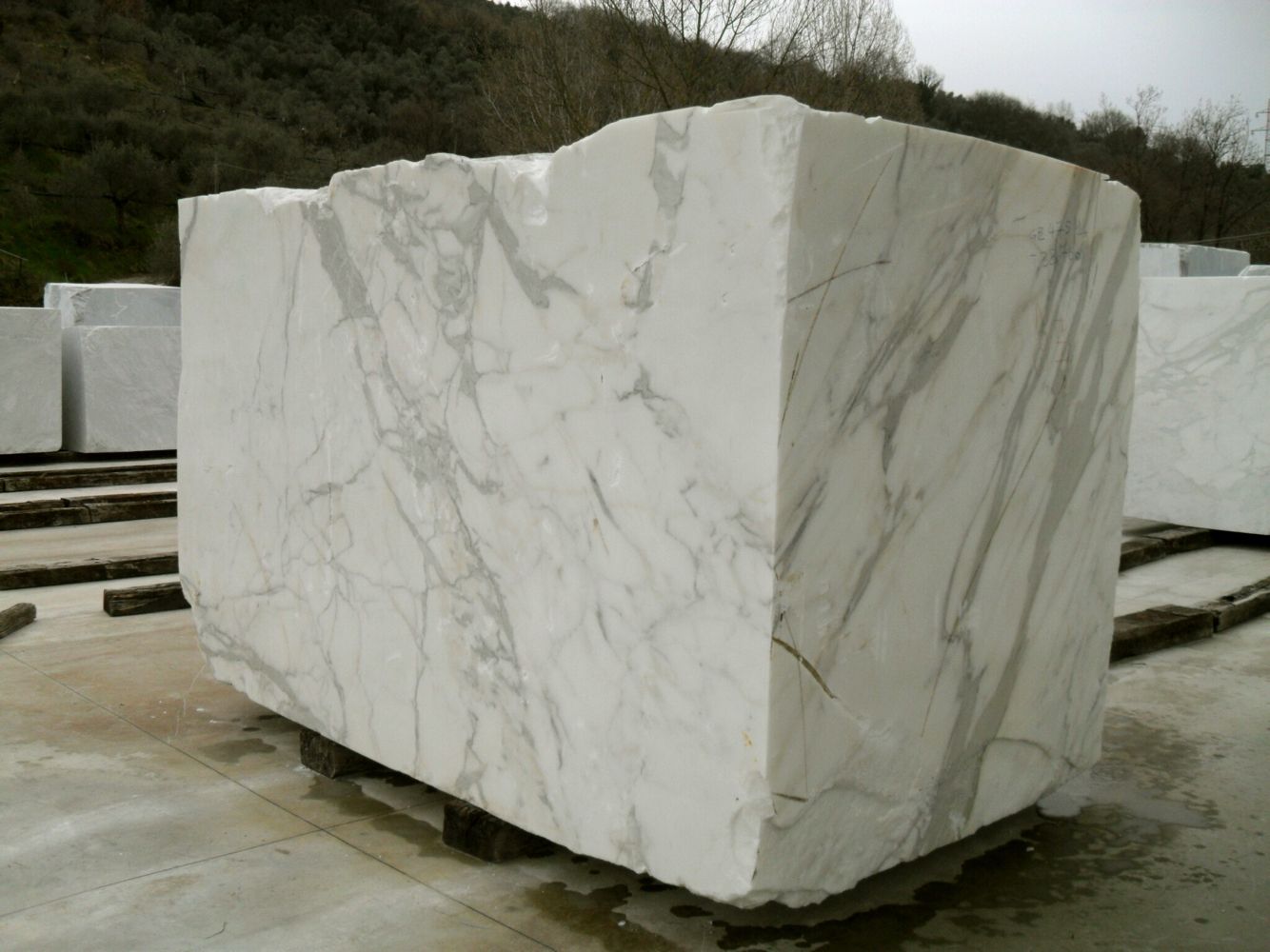
 Marble statue of George Washington. Credit: Spencer Platt
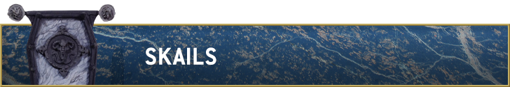
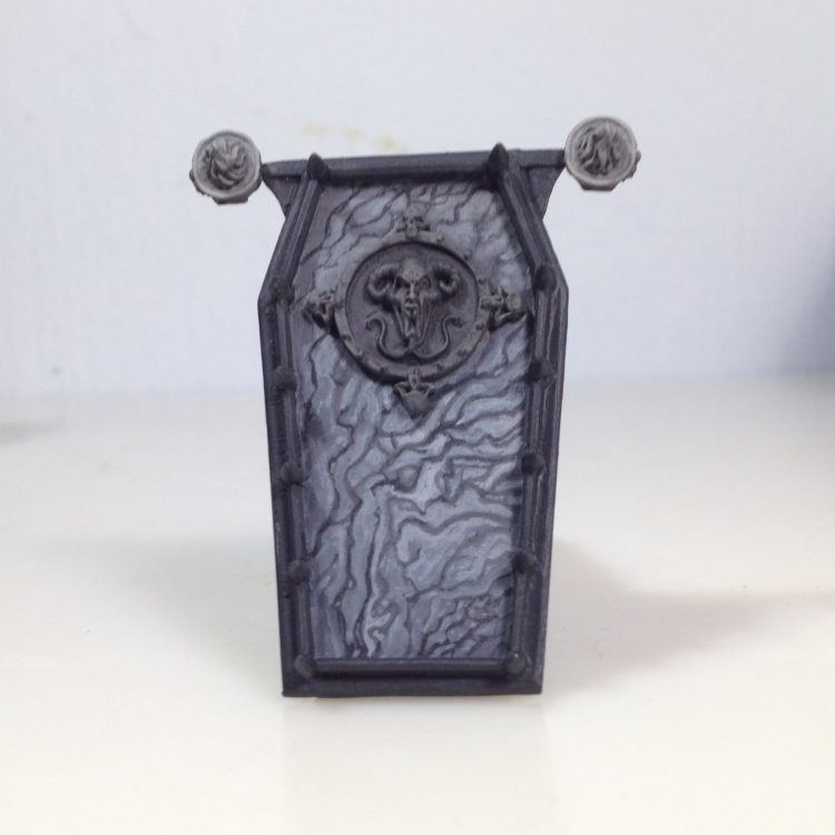
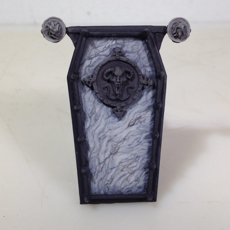
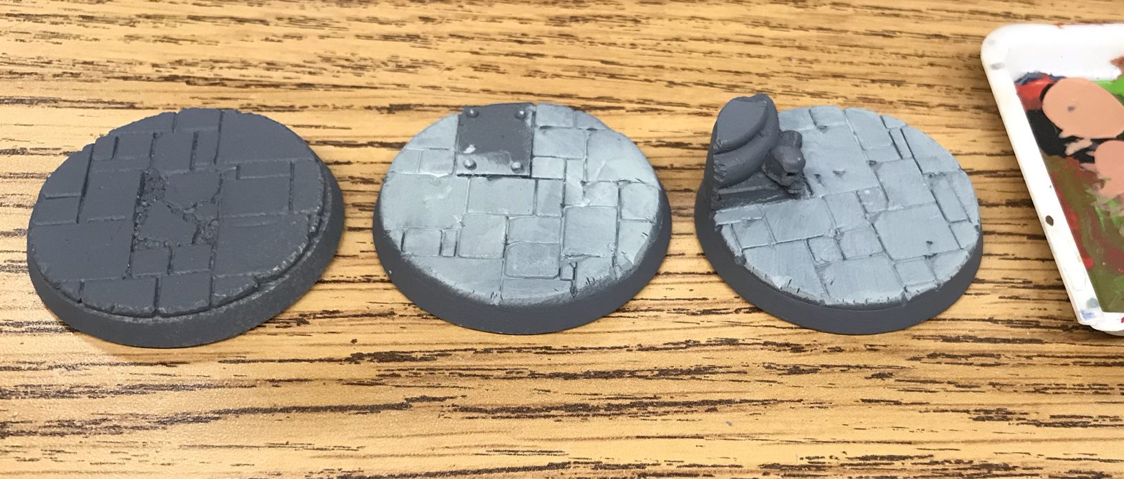
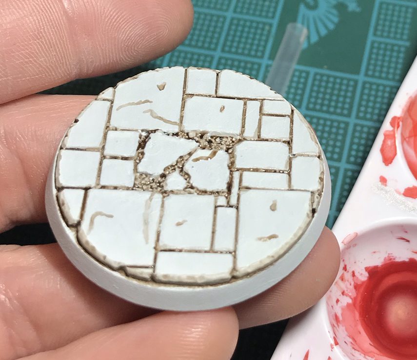
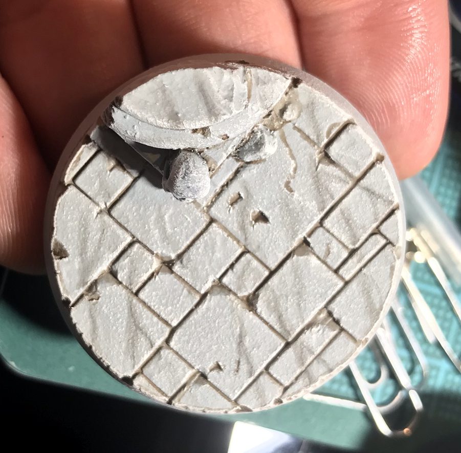
The example I'm using here is the top of the original Vampire Counts black coach. It's a nice big flat piece begging for some added interest. Thematically I wanted the materials to be wrought iron and marble to give it a victorian cemetery vibe. The ratios of paint I use here are rough estimates, and my process is largely done by feel. Marble has a wide variety of textures and hues, I'm building up a densely textured surface, however for a lighter, smoother marble you could do the final step over a light grey base coat and selectively apply other steps as you see fit.
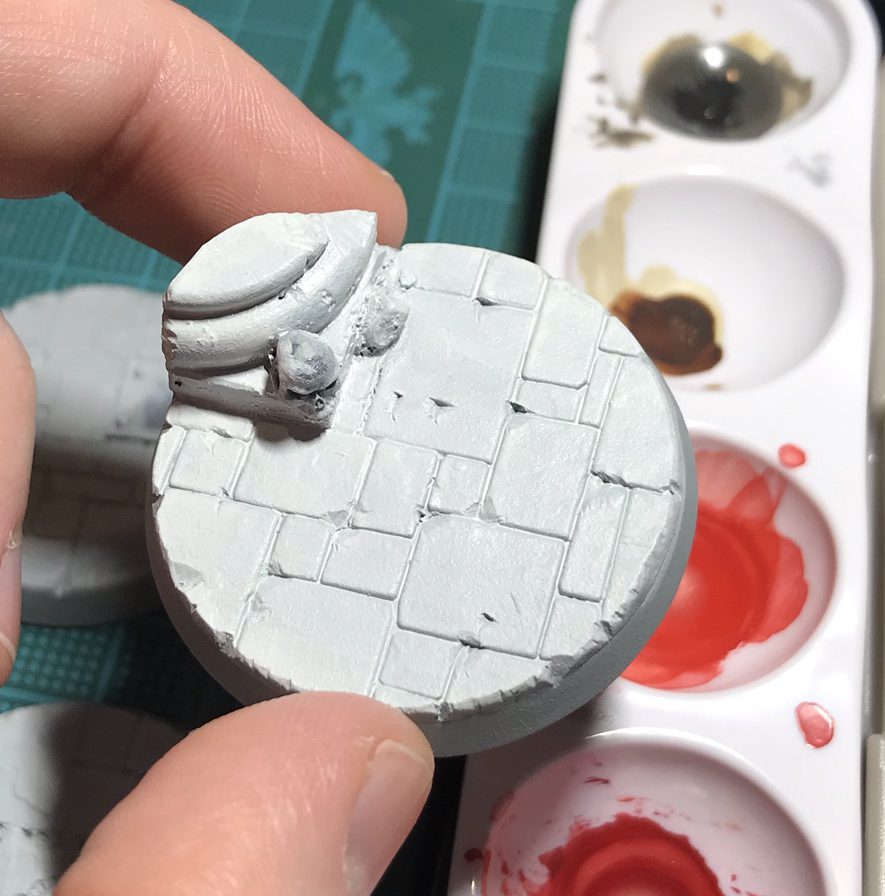
Materials: Rafael 8404 brush (size 1), Wet Palette, Visual Reference (GIS) A wet palette will make this process easier, allowing shades to be mixed without drying out. If you don't have one check out this guide to easily build a wet palette. I'm using a kolinsky sable brush with a very nice point, which allows for painting fine lines with paint of the right consistency. Paints used: Vallejo Game Colors- Dead White, Stonewall Grey, Black, Vallejo Matt Medium
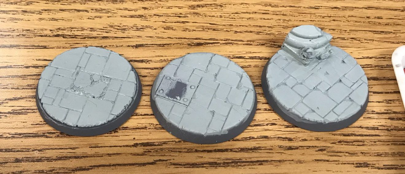
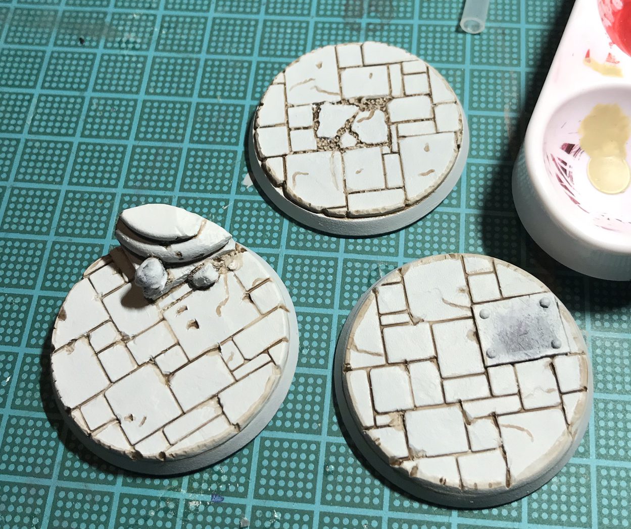
To begin with, this piece was primed with a mix of Stylnylrez Ebon Flesh, and white, hit with a top down angled burst of pure white. I wouldn't say this is necessary, but a solid grey or white prime would be good. Black would be too dark to start, unless you were doing black marble, in which case you could just inverse the process I have here.
Base layer is a mix of Stonewall Grey and Black, mostly a mix of about 2:1. Mix was loose and varied a bit over first layer to add some initial texture.
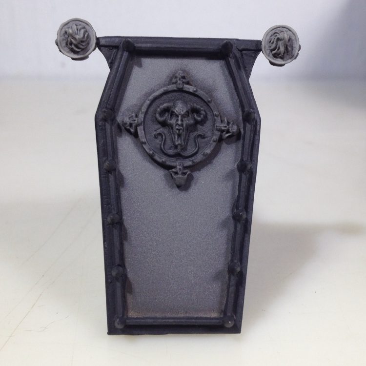
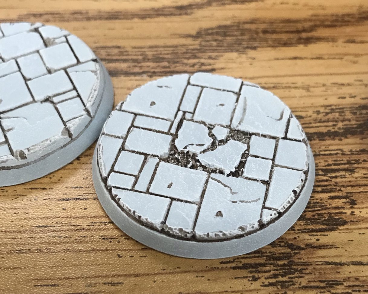
Now the veins are painted in with a mix of grey and black, about a 1:2 ratio. I decided to paint the veins generally going from bottom left to top right. Lightly pull the brush across the surface and add little squiggles. The marble I looked at tended to have a variation in vein sizes, definition, and density. I tried to capture some of that by having more smaller lines in some areas, and the bigger lines will be broken up later on. As the lines were being painted the paint would get thinner, making some of the lines lighter. I washed in a few of the smaller open spaces with this thinned paint before reloading the brush. This all adds some natural variation which will add the the effect.
Next I mixed a tone lighter than the base coat, the exact mix isn't too important at this point. Pure stonewall grey would be close to this. The spaces between the veins are filled in with this lighter grey. The thicker veins can be made thinner now, and in some spots I just added a small dot or streak of lighter grey to break up the thicker dark grey parts. I tended to focus more of the paint towards the top right corner of the shapes. Again, the paint thinned out some and got more watery as I worked. This is annoying when trying to make a clean solid surface, but in this case it adds to the variation of something derived from natural processes.
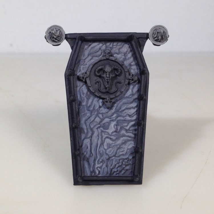
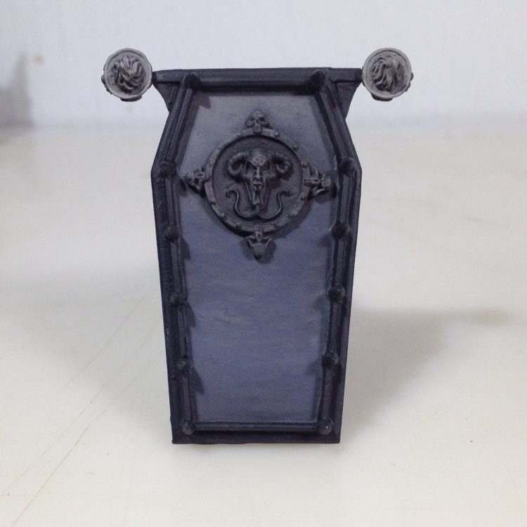
Here I came back with a mix of grey and white. Something like a 2:1 ratio. Lighter areas were hit again and also reduced some of the black lines some more and made some of the light areas bigger. This is mostly by feel at this point, and to match the tone of the rest of the coach. The next few steps continue this process.
The body of the coach already has already been painted a lighter marble, so I want to tone down the dark lines and create some larger white areas. I have worked over most of the surface with stonewall grey mixed with a bit of matt medium, at least a 1:1 ratio. Matt medium is simply paint binder without pigment, added to paint it increases transparency without reducing body. Much of the focus was on making the dark veins thinner and lighter.
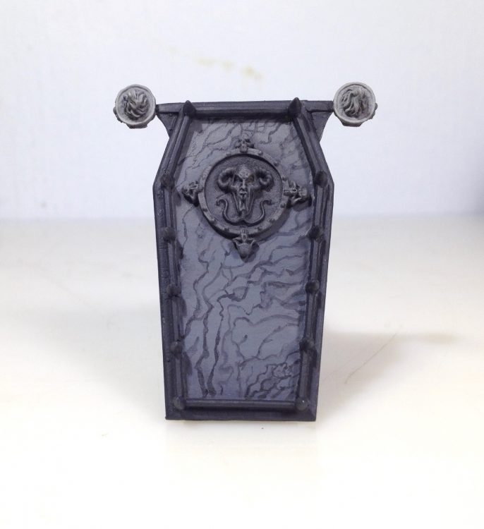
In this step stonewall grey was mixed with white and matt medium 1:1:1. It was used to open up and lighten some of the white areas.
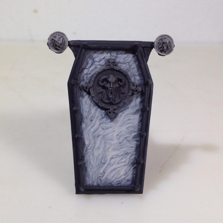
Now a mix of stonewall grey and medium mixed about a 1:1 ratio is used to continue smoothing out the contrast between the darker lines and lighter open areas.
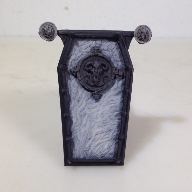
To finish the marble texture a mix of 3:1 stonewall to black + a bit of medium was used to redefined parts of the vein structure and tie some of them together. This created little pockets of white that is a common feature of marble.
 Credit: JD Reynolds
 Credit: JD Reynolds
 Credit: JD Reynolds
 Credit: JD Reynolds
 Credit: JD Reynolds
 Credit: JD Reynolds
 Credit: JD Reynolds
 Credit: JD Reynolds
 Credit: JD Reynolds
Tags: Painting | hobby | thechirurgeon | How to Paint Everything | featured | skails | marble | JD Reynolds

Thank you for being a friend.
 Goonhammer App and Patron Updates: April, 2026
 Kill Team Tournament Report: Engage, Party, Repeat's March Madness 2026
 Goonhammer Reviews: Tribal Conquest
Support us on Patreon to get access to our Discord and exclusive App features.
Thank you for being a friend.
Already a Patron? Login with Patreon.
Visit our incredibly official store on RedBubble.
![]()
![]()
Support us on Patreon to get access to our Discord and exclusive App features.
Thank you for being a friend.