There is a lifetime of study to be had in traditional 2D painting. I am not about to try and teach that in 500 words since I’m about as qualified for that as Ozzie Osbourne is to host a bat-themed food safety class for children.
That being said, there are still useful things to go over as regards applying 2D art to 3D models. Moreover if you’ve learned how to layer colours and have a vague understanding of light and shadow, you’ve already got a bunch of 2D painting skills.
This section, therefore, will provide a variety of useful tips.
Motherfudging REFERENCE
I know we already covered it, but this becomes an even bigger deal when you’re trying to go hog wild on the detail. There is no finer shortcut to visual assery than declaring “I know what X looks like.” This becomes doubly true if you’re trying to paint anything more complex than a basic icon.
By way of example, let’s go through a step-by-step of an Empire banner I painted way back in 2012. Having chosen a deer skull for this regiment, the Blades of Taal (the Old World god of the wilds, see?) I went looking for reference. I had an idea in my head of what a deer skull would look like, but there were so many details I had no idea about. I can’t find the original source for this image, so apologies to the owner, but have a look:
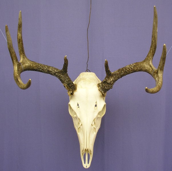 Image credit: unknown; it's from 8 years ago and seems to have disappeared from Google image search.
What are those holes on its forehead? And what’s the broken texture just below the eye sockets? I have no idea, but that’s why we use reference photos. Thus armed, I embarked upon the steps outlined earlier, but with more colours, more layering, and more glazes, blending, swearing, inaccuracies, regrets, crying, acceptance, and closure.
Image credit: unknown; it's from 8 years ago and seems to have disappeared from Google image search.
What are those holes on its forehead? And what’s the broken texture just below the eye sockets? I have no idea, but that’s why we use reference photos. Thus armed, I embarked upon the steps outlined earlier, but with more colours, more layering, and more glazes, blending, swearing, inaccuracies, regrets, crying, acceptance, and closure.
 Credit: Beard Bunker
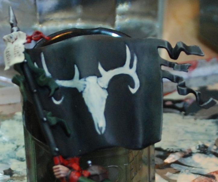
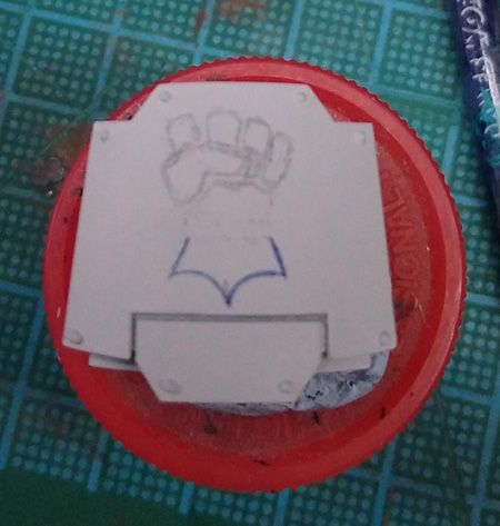
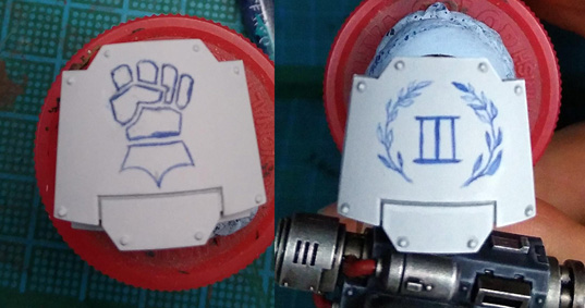
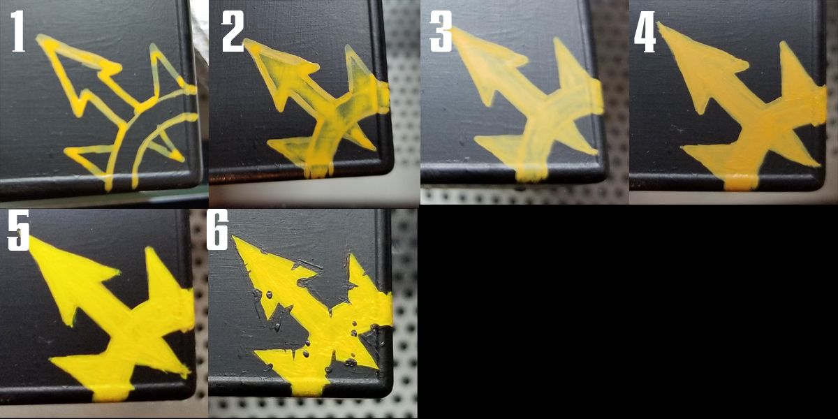
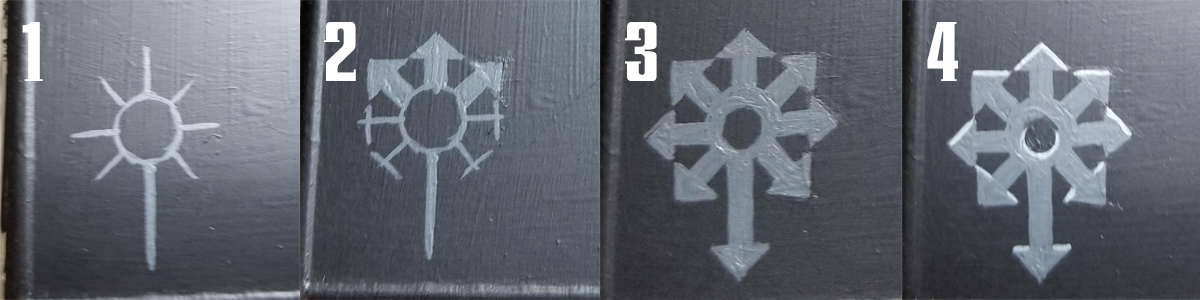
Above: Any image can be broken down into triangles and other simple geometric shapes. The overall shape of the design is
literally a triangle, so the three dots in the image above serve to locate the design and show me how much space it'll occupy. Note that I've put it off the horizontal centre line. This is to try and keep the skull itself as central as possible while still leaving room for the darker antlers.
 Credit: Beard Bunker
Above: When I say 'sketch loosely,' this is just how loose I mean. If you're trying to make your design look good at this point you're being needlessly slow and careful.
 Credit: Beard Bunker
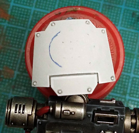
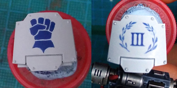
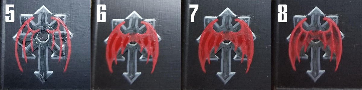
Above: It's starting to tighten up now, and obviously getting more solid. Even so, note that the top of the skull is too flat compared to the reference, and this mistake has been fixed by the time the image below was taken.
 Credit: Beard Bunker
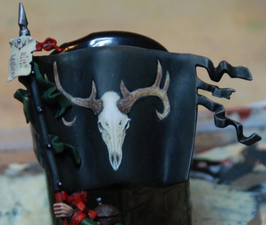
Above: Here I've used thinned black paint to sketch the cracks and lines in the skull, and dots of thinned brown paint to start laying some texture onto the horns.
 Credit: Beard Bunker
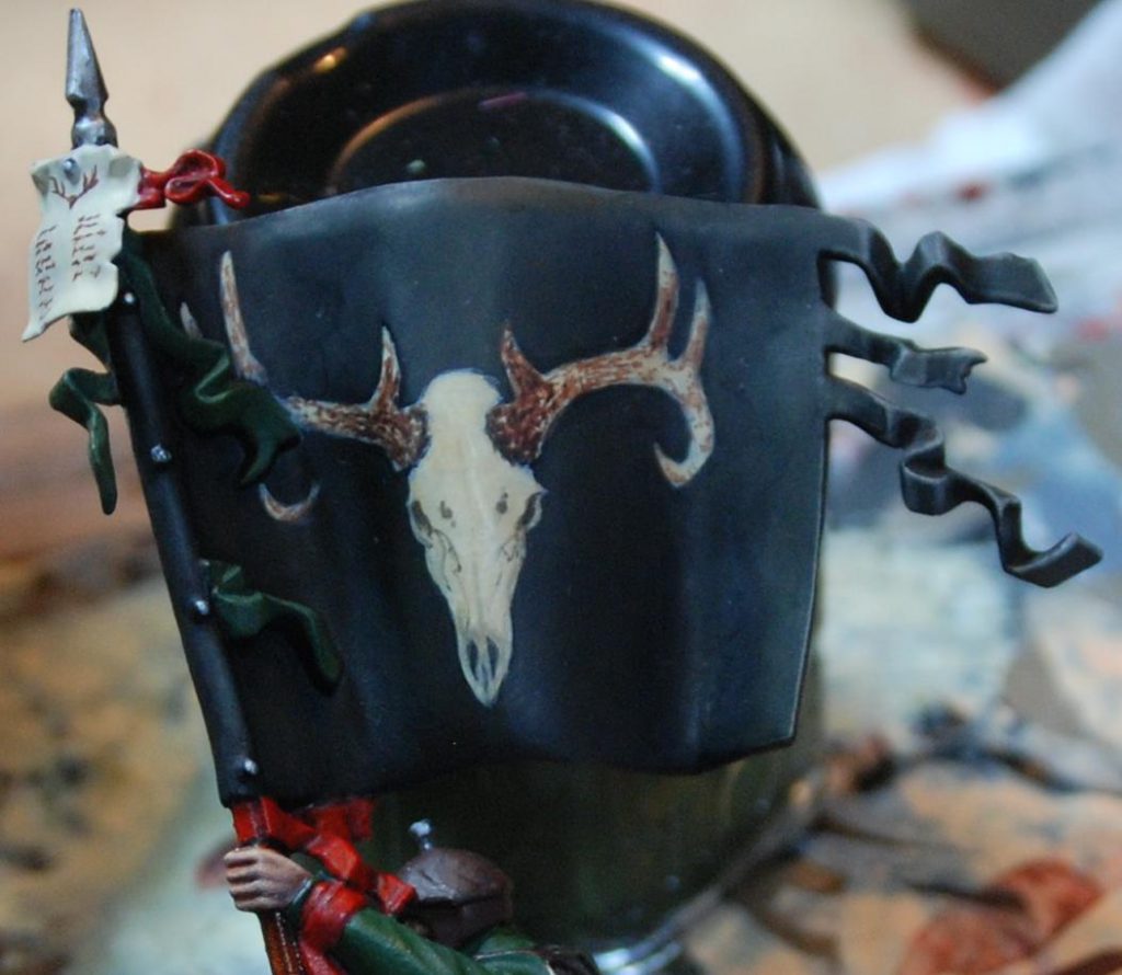
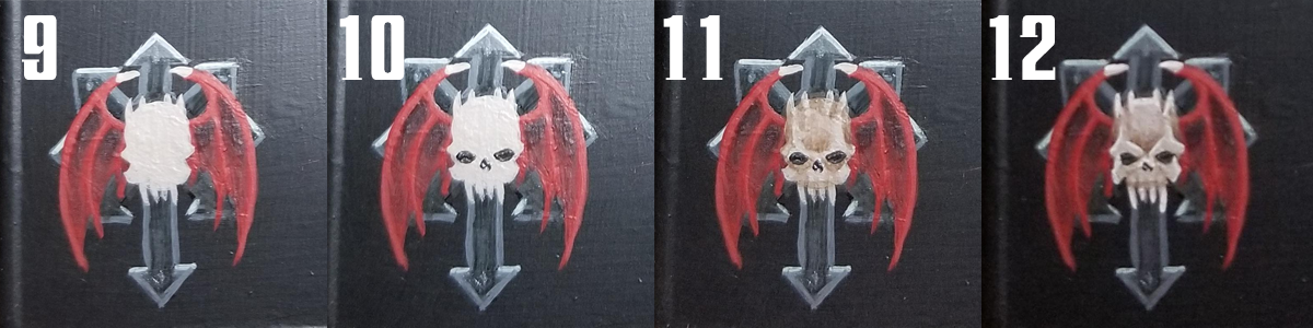
Above: a sepia glaze is used to darken the whole design down but keep it tied together in preparation for highlighting.
 Credit: Beard Bunker
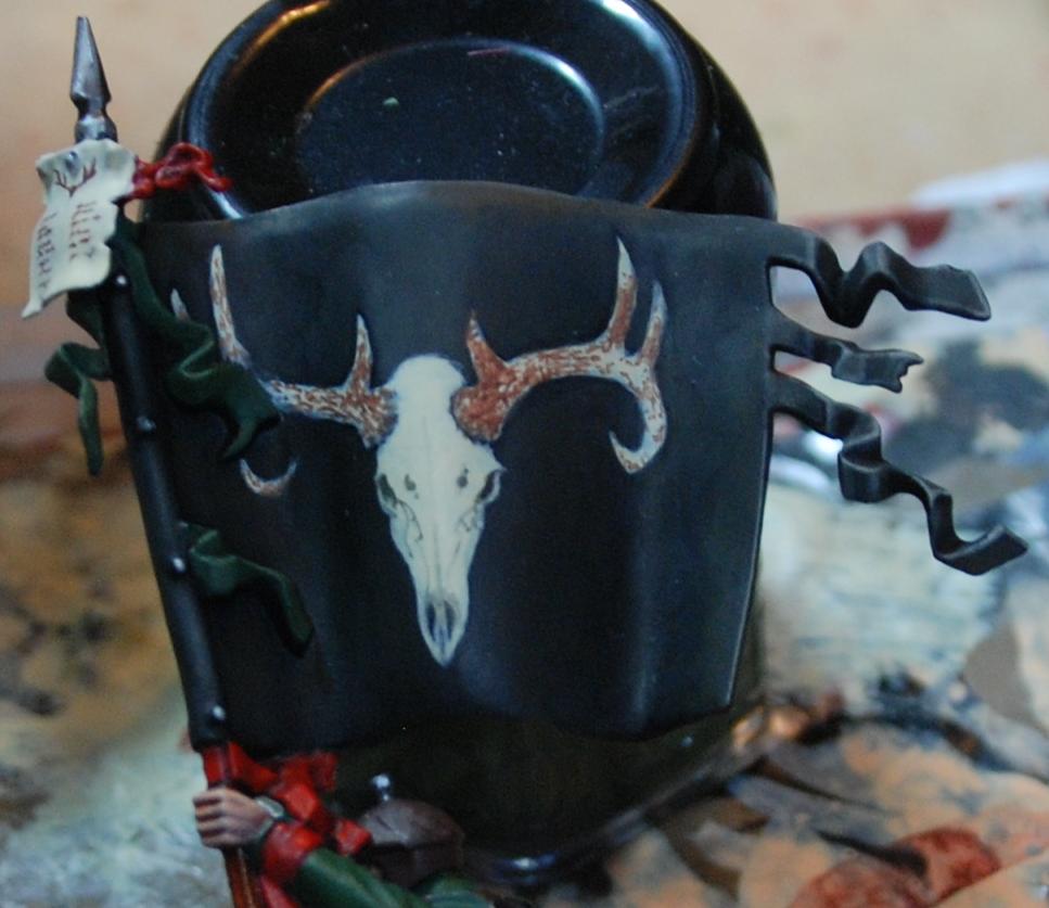
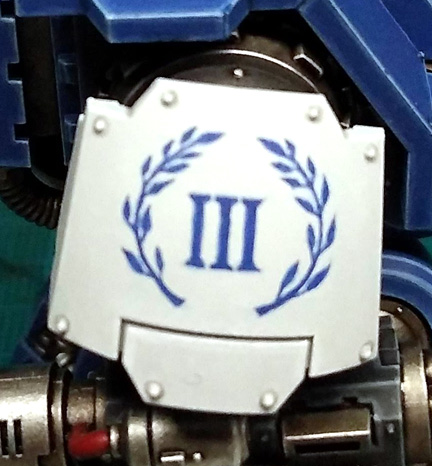
Two changes have occurred in the image above. The first and simplest thing is a bone glaze over the antlers to flatten it a bit and pull the tint closer to the skull. Secondly, white has been used to highlight the skull. I've tried to keep the light fairly flat to keep it looking like an icon, albeit a very detailed one. The way I decide where to highlight is, essentially, to imagine where I'd put the highlights if it were a miniature and then... do that. This means broad, thin layers on smoother shapes like the cranium, and sharper accents on the eye sockets and nostrils. If you're not sure where to put your lighter tones, go back to the reference and look at where the shadows fall.
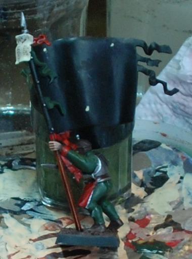
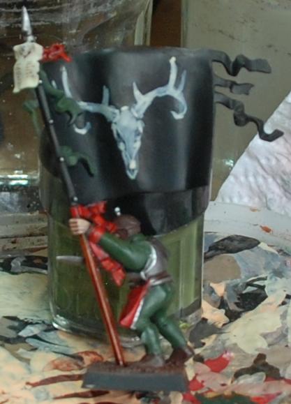
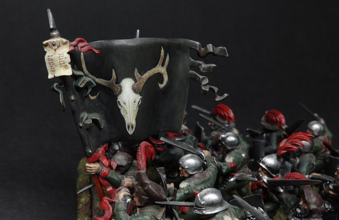
With the design itself done, the banner got a dirt/dust mix sloshed over it. Here it is sitting in its regiment, the Blades of Taal. The ambitiousness of the banner is intended to distract attention from the incredibly lazy paint jobs on the state troops themselves. Clearly, Hochland's finest aren't big on laundry day.
 Credit: Beard Bunker
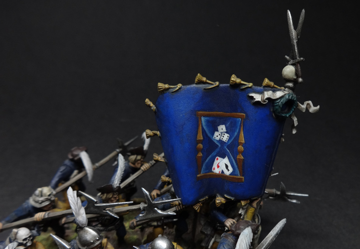
Where’s the light coming from?
When painting a miniature, your job is to exaggerate the shape of the thing so that it makes visual sense when it’s about two feet away, sitting on a table and looking pretty. This is often achieved by edge highlighting and by zenithal shading (meaning that you paint the miniature as if lit from above, because most of the time, it will be lit from above). This increases the contrast and makes your miniature pop. Since freehand is, you know, flat, you’re going to have to decide where the light source in the image is. This is particularly true if you are depicting any reflective surfaces. This also helps you figure out where you should shade, and where you should highlight.
Look at the wood on the hourglass in the banner below. I’ve depicted the light as being above and slightly to the right, and this has determined where the highlights go. It’s not a masterpiece but hopefully it gets the point across.
Credit: Beard Bunker
Where’s the light coming from?
When painting a miniature, your job is to exaggerate the shape of the thing so that it makes visual sense when it’s about two feet away, sitting on a table and looking pretty. This is often achieved by edge highlighting and by zenithal shading (meaning that you paint the miniature as if lit from above, because most of the time, it will be lit from above). This increases the contrast and makes your miniature pop. Since freehand is, you know, flat, you’re going to have to decide where the light source in the image is. This is particularly true if you are depicting any reflective surfaces. This also helps you figure out where you should shade, and where you should highlight.
Look at the wood on the hourglass in the banner below. I’ve depicted the light as being above and slightly to the right, and this has determined where the highlights go. It’s not a masterpiece but hopefully it gets the point across.
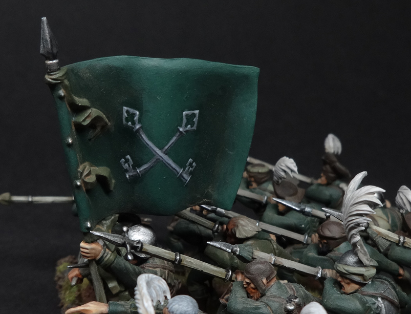
 The Salzenmund Chancers were possibly Nordland's most superstitious regiment. Would that this superstition had saved them from being on the Old World when it exploded. Credit: Beard Bunker
Advanced technique side-note: why not simultaneously shade both freehand and background with glazes?
One way to deal with a situation where both the background and the freehand need to be shaded (perhaps the freehand disappears into a fold in some fabric or whathaveyou) is to use glazes. Consider painting the whole thing as a flat two-tone design and then use a succession of darker, neutral glazes to put transparent shadows over the whole area. This ensures the freehand design fades according to the light, but obviously it won’t work with every colour combination. Proceed with caution and a willingness to experiment.
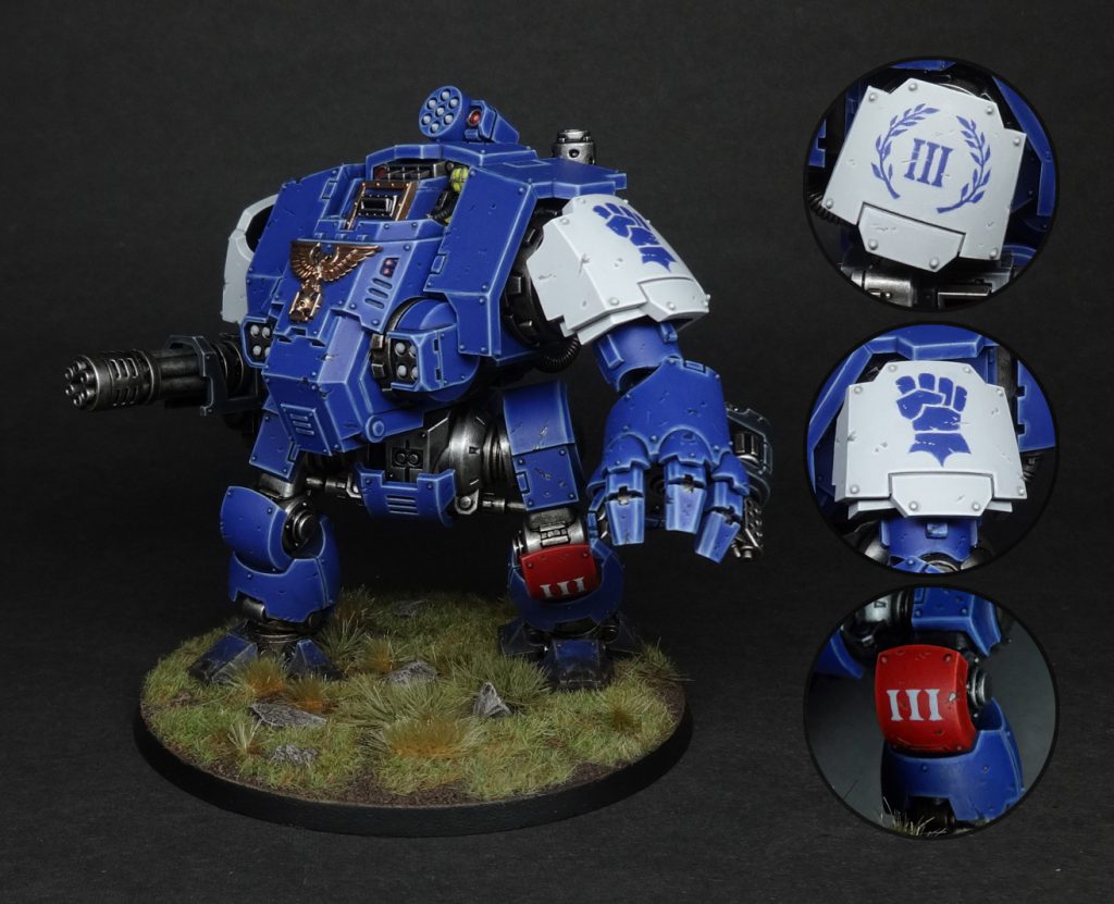
It’s NMM time!
I don’t usually use non-metallic metals as I prefer the look of metal paints for metal, particularly on gaming pieces. When you’re freehanding metallic details, though, it’s basically mandatory since you’re representing an area of paint/cloth/whatever. Assuming you’ve decided on the light source (see the tip above), everything follows on from that. Again, find some reference if you can, since light and shadow works very, very weirdly on metal. There are plenty of NMM tutorials out there which will tell you which colours to use, and the article I linked earlier by Richard Gray is an exquisite example of someone doing this like a boss.
I have a simpler example below, again from my Empire army’s many flags, so that you can see what I mean about having a light source (in this case from above):
The Salzenmund Chancers were possibly Nordland's most superstitious regiment. Would that this superstition had saved them from being on the Old World when it exploded. Credit: Beard Bunker
Advanced technique side-note: why not simultaneously shade both freehand and background with glazes?
One way to deal with a situation where both the background and the freehand need to be shaded (perhaps the freehand disappears into a fold in some fabric or whathaveyou) is to use glazes. Consider painting the whole thing as a flat two-tone design and then use a succession of darker, neutral glazes to put transparent shadows over the whole area. This ensures the freehand design fades according to the light, but obviously it won’t work with every colour combination. Proceed with caution and a willingness to experiment.
It’s NMM time!
I don’t usually use non-metallic metals as I prefer the look of metal paints for metal, particularly on gaming pieces. When you’re freehanding metallic details, though, it’s basically mandatory since you’re representing an area of paint/cloth/whatever. Assuming you’ve decided on the light source (see the tip above), everything follows on from that. Again, find some reference if you can, since light and shadow works very, very weirdly on metal. There are plenty of NMM tutorials out there which will tell you which colours to use, and the article I linked earlier by Richard Gray is an exquisite example of someone doing this like a boss.
I have a simpler example below, again from my Empire army’s many flags, so that you can see what I mean about having a light source (in this case from above):
 Credit: Beard Bunker
That's the end of my bit, and so I shall pass the mic to TheChirurgeon. Leave a comment below if you have any thoughts or questions, and take care to specify whether you’d prefer me to answer coherently, or in the manner of a mad Scottish prophet halfway into a bottle of whiskey.
Credit: Beard Bunker
That's the end of my bit, and so I shall pass the mic to TheChirurgeon. Leave a comment below if you have any thoughts or questions, and take care to specify whether you’d prefer me to answer coherently, or in the manner of a mad Scottish prophet halfway into a bottle of whiskey.
 Credit: Beard Bunker
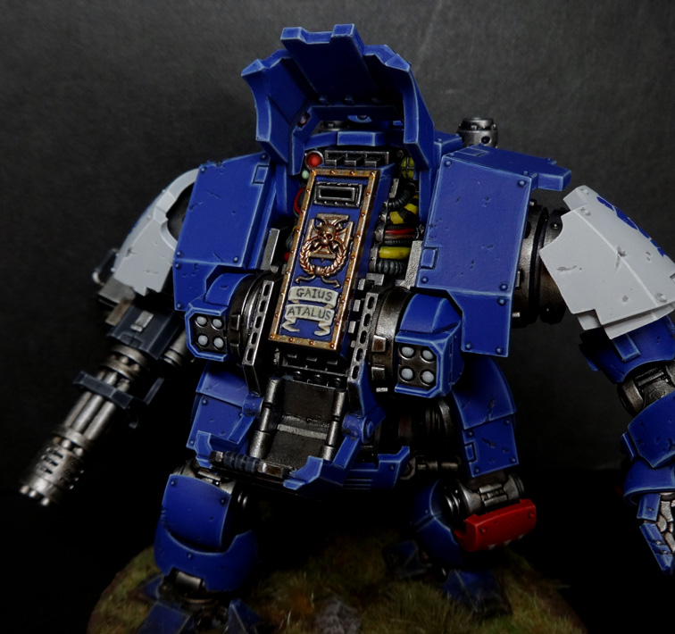
 Gaius Atalus (deceased) - Credit: Beard Bunker
 Credit: Beard Bunker
 Credit: Beard Bunker
 Credit: Beard Bunker
 Credit: Beard Bunker
 Credit: Beard Bunker
 Credit: Beard Bunker
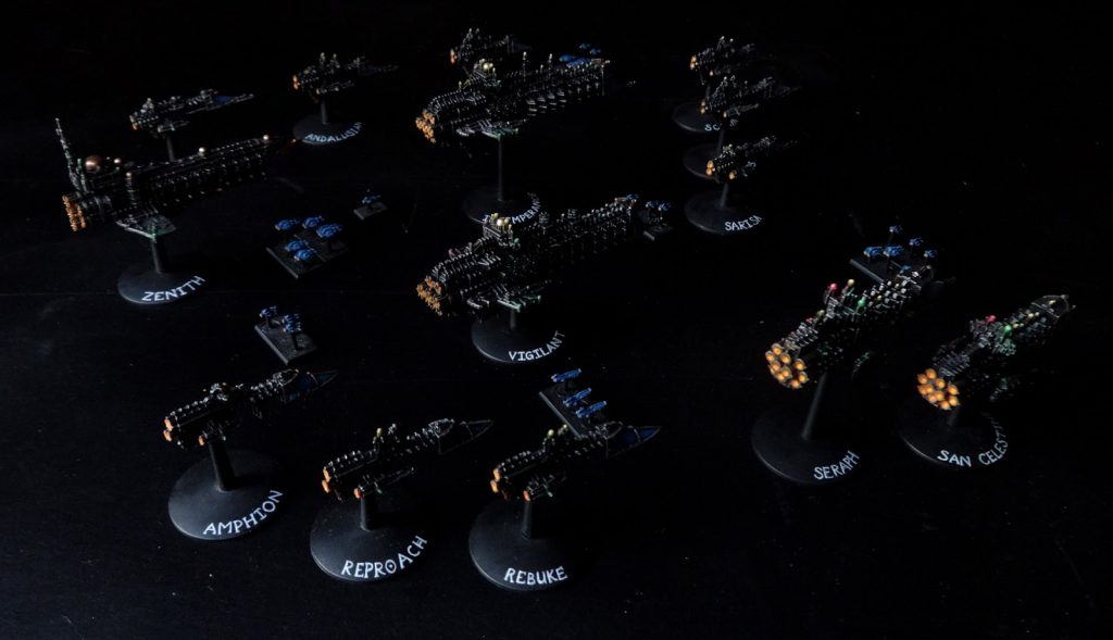
 Credit: Robert "TheChirurgeon" Jones
 Credit: Beard Bunker
 Credit: Beard Bunker
 Credit: Robert "TheChirurgeon" Jones
 Credit: Robert "TheChirurgeon" Jones
 Credit: Robert "TheChirurgeon" Jones
 Credit: Robert "TheChirurgeon" Jones

 Goonhammer App and Patron Updates: April, 2026
 Kill Team Tournament Report: Engage, Party, Repeat's March Madness 2026
 Goonhammer Reviews: Tribal Conquest