In our How to Paint Everything series we look at how to paint well, everything, with different techniques and approaches. This week we’re looking at how to plan and execute a simple but striking paint scheme for massed troops in Conquest.
Step 0 – Colour Scheme Planning
Step 0 in painting, like the Laws of Robotics, is concerned with something boring like 'overriding other rules in order to resolve contradictions you didn't predict earlier'. We often talk about the steps taken to deliver paint from the pot to the model but I feel it is my duty to stress that a good looking army starts in the planning phase.
For this army, I wanted a contrast between the warm and cool colours between the models and their bases. At first, I was tempted to go with dark blue/purple sand dunes, as if the Sorcerer Kings were marching at night, using OSL on their many models wielding fire (if you recall the Cave of Wonders scene from Disney's Aladdin...
the" frameborder="0"> good one...you'd be bang on with my vision). However, the lovely RobShep had beaten me to the punch with his amazing
Old Dominion army. So, I decided to reverse the concept and go with a warm basing scheme and cool colours for the models, focusing on a rich blue-green teal and royal purple as the common colour across most units, as well as fluoro green fire (as a red-yellow fire would be a warm colour).
Step 1 – Bases
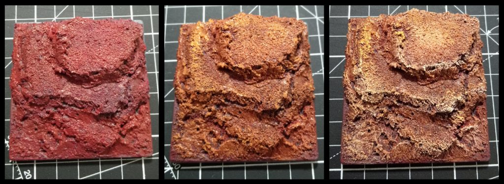 Sorcerer King bases - step by step
In a departure from the standard dismountable bases that Parabellum ships with their models, I have chosen the
Path of Tall. Having your models stepped up on various levels of elevation will make them taller than whatever weak and pathetic models your opponent has ranked up against you. Your opponent, suitably cowed by this, will then proceed to roll poorly and lose the game (At least, I think that's how it works). This masterstroke in psychological warfare is relatively easy to implement, I use several blocks of cork, carved into irregular shapes and then applied a mixture of sand, PVA glue and
spak-filla to add texture as well as blend the different levels together. Having various elevations within a base also means that you can have your models in the back ranks be more visible, rather than hiding behind your front rank.
Now, as for painting them...
Step 1: I used a deep brown-red to basecoast the entire base. I used a custom blend of red and brown, adjusted to taste but you could get away with either GW's
Mournfang Brown or Vallejo's Game Colour
Scarlet Red. This is all applied with a wide, thick (and hopefully cheap) brush just to slap the paint on.
Step 2: Here I adjusted my mix to have more orange-brown in it, something like
Jokaero Orange or Vallejo's
Bronze Brown. You don't want 100% coverage but maybe 80-90%. After this, you'd refine the mix to have more of your orange-brown in it and start overbrushing it across the more textured areas/edges.
Note: Over-brushing is basically dry-brushing without removing as much paint fromt he brush as you do with dry-brushing. However, calling it wet-brushing would be incredibly confusing, so over-brushing is what we call it...
Step 3: Here is where we start adding
Bleached Bone (I'm dating myself badly in using this reference), or rather
Ungor Flesh for GW and Velljo's
Tan Yellow, into the mix and give the base a cheeky drybrush on the edges to build up more visual interest.
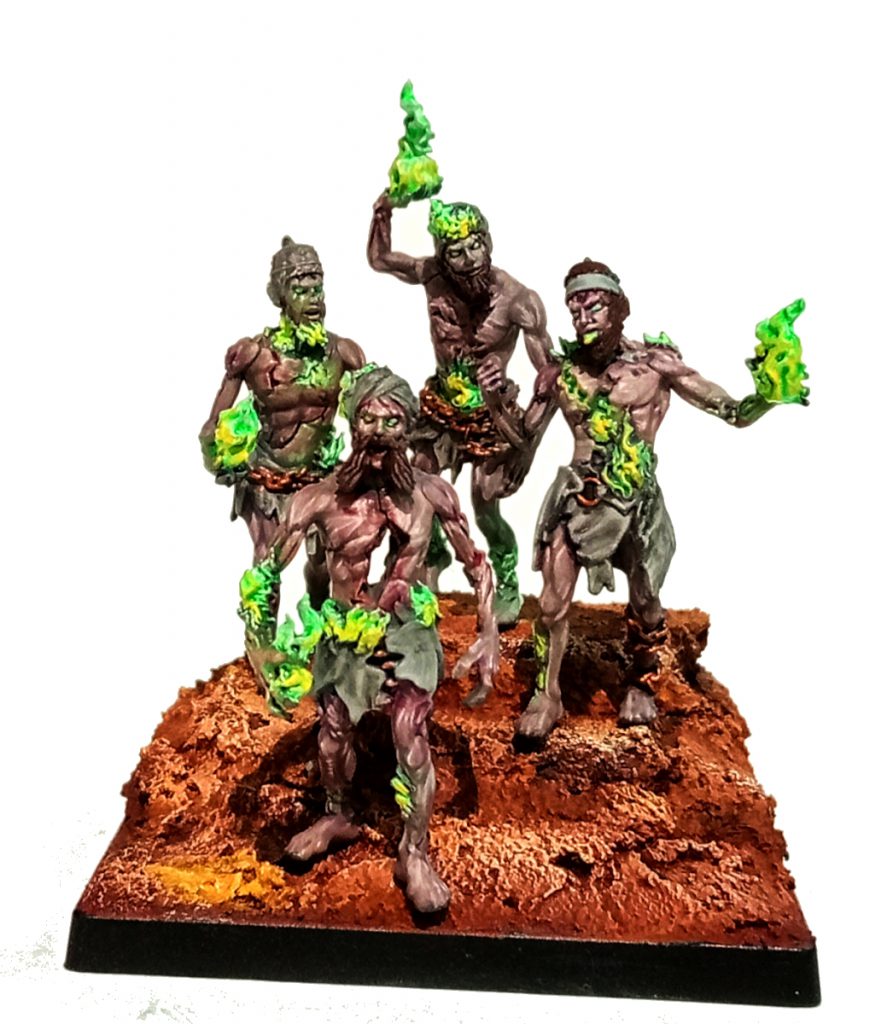
Ghols
For my Ghols, I wanted to use grey-tone skin colours to really sell them as recently deceased zombies. Additionally, I wanted their clothes/rags to be a neutral colour so that the fluoro green fire stands in stark contrast to otherwise dull,
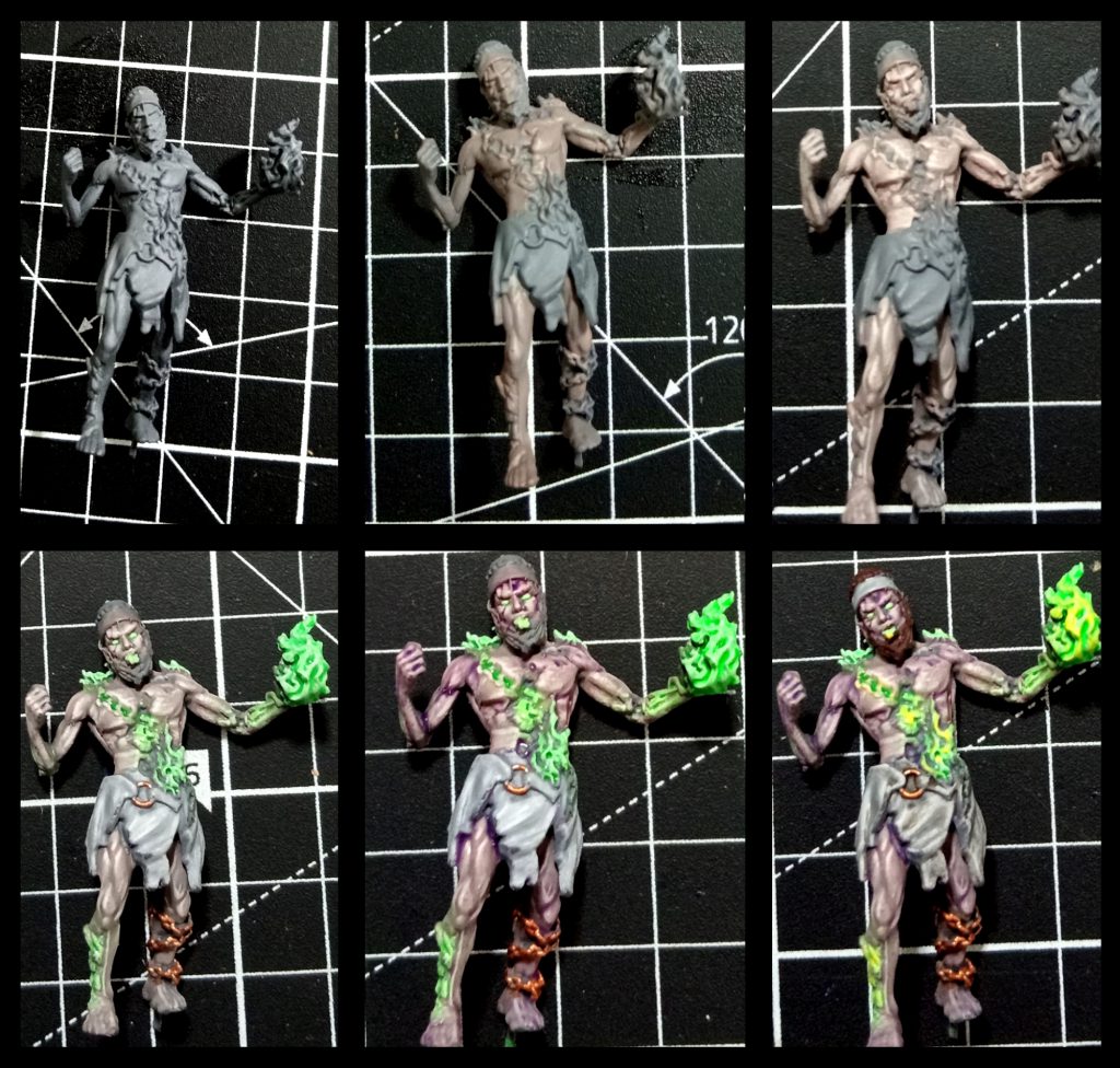 Step 1:
 Undercoat the model with a mid-tone grey. Importantly, you want to pick a primer that has no hue to it (some greys might be cooler, more blue, than others and some might be more 'warm' or have a hint of cream in them). I'm actually the sort of monster that uses cheaper hardware primer on
some models, in this case:
Rust-Oleum Flat Grey Primer but the more discerning hobbyist might choose GW's
Mechanicus Standard Grey or Vallejo's
German Field Grey (though, I think I see a hint of green in it...).
Step 2: Grey-tone skins usually start with a 50-50 blend of a neutral grey with a flesh tone. In this case, I started with Vallejo
Light Grey (70.990) and Army Painter
Tanned Flesh but also added in a smidge of
Cork Brown (70.843) in order to get a skintone that's a bit less of a 'Caucasian Phenotype' (tanned flesh has a bit too much red/pink in it). Just slop it in, no finesse needed yet.
Step 3: The next step is to tweak your grey-flesh mix with a higher ratio of flesh than grey (ie. move from 50-50 to 65-35) and apply that to the raised musculature. On the next pass you'll mix in some sort of cream colour (Bleached Bone is the platonic ideal of cream paints but in the absence of it I use Vallejo's
Elfric Flesh, 72.098), with more defined coverage, even moving into using a detail brush to work the fine muscle banding/fibres. You
want there to be fine lines of muscle fibres.
Step 4: If you're keen, add in subtle highlights of Elfric Flesh for the musculature.
Then use a slightly lighter grey than your undercoat to give the rags/clothes some definition. We're keeping this very simple because we need to smash out an entire unit of zombies.
This step also involves hitting all of your fire sections with a pure white before applying one of my favorite paints to them: Vallejo's
Fluoro Green (70.737), which somehow has the perfect balance of being translucent when you want to do OSL effects while still having enough saturation to look good in blocks of colour. I like doing the eyes this way, as well, as it helps sell them as being horrible husks of ex-human powered by magic.
Charming.
Any metal elements of the model can be done in whatever metallic you want. For my scheme, I wanted to lean into the more 'reddish' metals, such as copper or brass rather than silver metallics, which might get lost in the grey tones of the skin and clothes.
Step 5: Here we use a purple wash to lightly glaze the grey-tone skin. I use Army Painter
Quickshade Purple Wash but whatever works for you. While I do love GW Contrasts to glaze colours I think Contrasts would veryveasly overwhelm the grey-tone skin here, so suggest a watered down wash.
We also use a red wash on the metallics, just to push them further into 'warm' hues. You can also slap some of that red wash into the more
gory wounds on the model to help sell the body-horror.
The fire also gets a very brief overbrush highlight with a 50-50 mix of white and fluoro green.
Step 6: To wrap the model up, we slap a dark brown onto the hair (anything Chocolate brown, you can even use a Contrast paint like
Dark Oath if you want to move quickly). Watered down
Ratling Grime contrast to wash the rags and then a 50-50 mix of your brightest yellow with the fluoro green to highlight the 'hottest' areas of burning goodness.
And we're done:
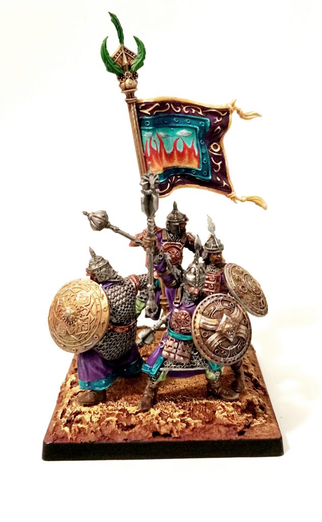
Rajakur
For my Rajakur I wanted to lean into two themes: Cool colours like teal and purple, and metallics.
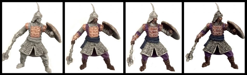 Step 1:
 After a basic undercoat (see the Ghol tutorial above: mid-tone flat grey), we basecoat the metallics on. Game Colour
Brassy Brass (72.058) for the brass and whatever gunmetal you prefer (I use Army Painter
Gun Metal for me).
Step 2: In this step we base coat the clothes: Model Color
Dark Prussian Blue (70.899) for the sash and
Royal Purple (70.810). Skin tones start as a 75-25 mix of
Charred Brown (72.045) and Army Painter
Tanned Flesh. Boots are the same Charred Brown.
Step 3: We highlight the clothes, blending
Blue Violet (70.811) into the Royal Purple and
Blue Green (70.808) into the Dark Prussian Blue at about 50-50 mixes. Boots are highlighted with a 50-50 mix of Charred Brown and
Cork Brown (70.843). Wash the brass with a purple wash (Army Painter
Purple wash is...fine...I find it doesn't distribute pigment evenly, so if you have something you prefer, use that). The skin is given a high percentage coverage layer (75% or so) of 50-50 Charred Brown and Tanned Flesh.
Step 4: Dark wash the gunmetal metallics with whatever you want,
Nuln Oil, Dark Wash, whatever works. Progress your cloth highlights with higher fractions of Blue Violet and Blue Green respectively. Same with the Cork Brown mix for the boots. Finish painting the face as you see fit. For the brass, use a detail brush to apply
Mithril Silver, Army Painter's
Shining Silver (or whatever bright silver you have) to theupper surfaces of the armour and specifically the shield. We're looking to build up a gradient from light to dark, top to bottom on the shields. Finally, using a watered down
Ratling Grime, wash the bottom recesses of the shields to complete the gradient. After that, pick out any details, such as helment and baner feathers in whatever colour you want and manage the banner however you see fit. If you hate yourself, freehand something deep and meaningful, like I did. See the fire and clouds below? Yeah, Court of Fire and Court of Air.
So clever.
As always if you want to get 10% off and support Goonhammer you can make your Conquest purchase by clicking here for US/Canada or here for EU/rest of world. You’ll also need to enter code “goonhammer” at checkout. Look, we don’t make the rules, that’s just how it works!
Have any questions or feedback? Drop us a note in the comments below or email us at contact@goonhammer.com. Want articles like this linked in your inbox every Monday morning? Sign up for our newsletter. And don't forget that you can support us on Patreon for backer rewards like early video content, Administratum access, an ad-free experience on our website and more.
Thank you for being a friend.

 Goonhammer App and Patron Updates: April, 2026
 Kill Team Tournament Report: Engage, Party, Repeat's March Madness 2026
 Goonhammer Reviews: Tribal Conquest