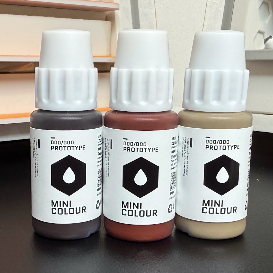
After more than 5 years in development, Artis Opus and Cult of Paint have launched the Kickstarter campaign for their joint paint range, Mini Colour. In advance of the campaign launching, Byron from Artis Opus sent across some prototype paints for me to test out and review, and also kindly included a pair of Artis Opus brushes in the package. Thanks to Mini Colour (Artis Opus & Cult of Paint) for the materials.
The Premise
Mini Colour: Paint For Everyone. It’s a compelling tagline. Browsing the Kickstarter page and chatting to Byron Orde of Artis Opus, there’s a clear intent behind the wording. The goal isn’t to imply that other paint ranges are exclusionary on a personal level, but that people often lean on different ranges for different purposes: one for basecoating, another for drybrushing, a third because they thin really well for airbrushing, another because they glaze so well. Personal workflow decisions like using a wet vs a dry palette, army painting vs display pieces, and airbrush vs (as Henry would say) hairy brush preferences can also contribute to the ranges that a painter chooses to use. Mini Colour aims to be the great uniter, a colour-first range that’s enjoyable to use for all levels of painters using a wide range of methods. As they put it in their video: beautiful colours, that are a pleasure to work with.
 A Cult of Paint airbrushing course, photo from the Kickstarter page. I'm picking this one because I'm in the background! Credit: Mini Colour
I think it’s fair to argue that given this brief, you’d be hard pressed to find a better spread of experience than the Mini Colour team. Byron, who prefers a dry palette and is well-known for the Artis Opus drybrushing (and other) tutorials on YouTube, has teamed up with Henry and Andy from Cult of Paint. Henry’s army painting tutorials are very popular, often focused on airbrush schemes backed up with carefully applied and economical brushwork and oil/enamel filters and washes for high impact across a whole force on the tabletop. Andy on the other hand is a highly-decorated display painter, the winner of over 20 Golden Demon trophies and multiple Slayer Swords. As you might expect, he’s very focused on colour placement, composition, smooth layers, and precise glazing and highlighting. Of course, all three are more than capable of stepping outside their comfort zones too, but if you look at these as their individual areas of expertise then there’s a really broad knowledge base to develop from.
This knowledge is a key part of the Mini Colour offering too. Henry, Andy and Byron are all experienced painting teachers, and that translates to a product offering that is supported by a wide range of information and education material via their website,
mini-colour.com. At the time of writing the site isn’t live, but the Kickstarter promises “extensive information on each paint, recommendations for sequences, and supporting education for many popular schemes within wargaming”, with information all the way from product listings to full YouTube tutorials designed to support painters of all abilities in making the most of the range and developing as artists.
 Mini-Colour.com example from the Kickstarter page. Credit: Mini Colour
This all sounds great in principle, but there are a
lot of well-loved paint ranges on the market already. Is what’s on offer here significant enough to capture the attention of painters?
The Range
Mini Colour is launching with an initial range of 63 paints in 17ml bottles: 10 different “sets” of 6 paints, plus a regular black, a matt black, and a white. Broadly the paints in the range are a kind of satin-matt finish, with the exception of the matt black which is (no prizes for guessing this) more matt than the others. There’s variation within each set though - although the colour sets are not designed as set triads, you do tend to find that the deeper, darker tones are a touch thicker and cover well, with a more satin finish. As you get brighter, colours tend to get a little thinner, and more matt, which feels well-suited for glazed layers and highlights. The range has a longer drying time than you might expect from other ranges.
The sets are covered in full on the Kickstarter page, but here’s a short summary of each:
The Red Set - Reds from dark to bright, including some different rich tones like claret
The Orange & Yellow Set - Oranges from burnt to bright, mustard, a lovely egg yolk yellow, and a bright canary yellow
The Warm Green Set - Natural, mossy, plant greens
The Cold Green Set - Cooler, mineral greens
The Jade & Turquoise Set - A trio each of classic jade and turquoise colours
The Blue Set - Saturated blues, from dark to light
The Purple Set - From deep, rich purple through to magenta, via a couple of pinker tones
The Warm Brown Set - Rich, warm, chocolate/red browns
The Cold Brown Set - Earthy, stony browns
The Lights Set - Lighter pastel tones
Colours are named a little bit more creatively than (e.g.) Pro-Acryl’s strictly descriptive “light blue”, but I’d say that most names do a pretty good job of communicating the idea of the colour. As long as you know what colour a papaya is, anyway. The naming is creative, but doesn’t delve into the esoteric world of copyrighted faction names like P3 or Citadel.
There are a few notable absences from the range at the time of launch. You’ll notice there are no metallic paints, and also no pre-mixed flesh tones. As Byron put it to me, this is simply because they were not happy with the quality of these colours, and wanted to keep on working on them. That’s not a promise that they’ll arrive in the future, though. Mini Colour are clear that they’re only going to release colours that they’re happy with, and would be happy to use themselves. In the Kickstarter video, Andy does hint that there will probably be future releases of more specialised colours in the future, but there are no details of what to expect or when for now.
The other thing that I would highlight as absent are any greys - look at any hobby-focused paint range and you’ll probably be able to find 10-20 grey paints, so this might be a bit surprising. You’ve got black, white and a ton of really rich colours though, so rest assured that you’ll be able to mix up any kind of grey that you want to.
Pricing
There’s a single tier available for backers at this point, which is £179 for the full set of paints. This does not include shipping, nor does it include any taxes relevant in your country. Keeping the UK as our example, we’ll include 20% VAT on top of the price, which gives a total cost of approximately £3.41 per paint excluding postage. We don’t know how this’ll compare to an eventual retail release, but let’s have a look at how it stacks up against some of the other popular ranges’ RRPs. I’ve ordered the list by price-per-ml, although obviously you do have to buy a full pot of paint from any of these brands. I’ve chosen the price for the basic acrylic in each case - many ranges have a slight uplift in price for metallics or special paints like washes and effects.
Scale Colour (Scale 75): £2.95/17ml - £0.17/ml
Model Color (Vallejo): £2.95/17ml - £0.17/ml
3rd Gen Acrylics (AK Interactive): £2.94/17ml - £0.17/ml
Warpaints Fanatic (Army Painter): £3.15/18ml - £0.17/ml
Mini Colour: £3.41/17ml - £0.20/ml
Pro-Acryl (Monument Hobbies): £4.55/22ml - £0.21/ml
P3 (Steamforged Games): £3.99/18ml - £0.22/ml
Citadel (GW): £2.75/12ml - £0.23/ml
Two Thin Coats (Duncan Rhodes): £3.95/15ml - £0.26/ml
Mini Colour (in the UK, at Kickstarter price) slots right into the middle of our sample - I think that’s perfectly reasonable for a reasonably boutique offering that’s taken a lot of development and input. There’s always a chance the retail bottles might cost a bit more, but I think they’d have to jump by quite a lot to feel like they were suddenly unreasonably priced. Of course, at the moment you’re tied into buying the whole set of Mini Colour, but more than one of these ranges (Two Thin Coats, P3) were also initially launched as Kickstarter campaigns.
The Review
Due to limited quantities of the prototype paints, Mini Colour weren’t able to share the full range with Goonhammer, which is totally reasonable. Instead we had an in-depth conversation about what sort of colours and materials were present on the painting projects in my queue, and Byron sent across a set of colours. Some of these were more direct requests from me, and some were chosen by Byron based on our conversation.
For each paint I'm going to give my thoughts on colour quality, my experience of using it, and generally try to communicate how I feel about it. I’m avoiding giving arbitrary numerical ratings or trying to create a complicated scoring metric, as I don’t ultimately think that helps to convey whether or not a paint is “good”. I’ll try to give some examples of other paints you might have used that they’re similar to as well, although that’s purely based on my feelings and not a claim that Mini Colour are making. Each photo has both a spoon, and a flat Citadel base - in each case, the spoon is airbrushed (usually 3-4 coats) and the base is hand-painted off of a wet palette (varying numbers of coats to get a solid colour) in both cases over a matt, mid-grey Pro-Acryl airbrush primer.
One final thing before we crack on. All of the photos of the paints are taken in the same position and conditions on my painting desk on top of a white piece of paper, under my Daylight Company Lumi lamp. The light and camera remain in the same position for each photo, and the camera settings stay the same too. There has been minimal post processing beyond cropping, just white balance and exposure adjustments. Where these adjustments are made, they’ve been applied universally across the set of photos.
What I’m saying is, these photos should be as accurate and consistent as I can make them without a professional photography studio. I can’t promise that my, or indeed your, screen is calibrated correctly to real life colour, but beyond that we should be pretty accurate .
Right, let’s get on with looking at some paints.
Reds
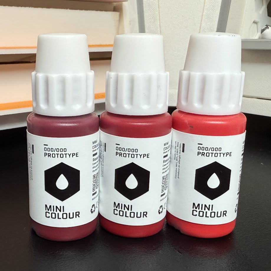 Mini Colour red bottles. Credit: Rich Nutter
I received three paints from the Red set: Sangria, Cherry, and Cardinal.
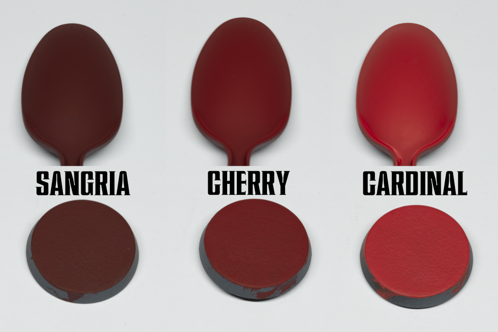 Mini Colour reds. Credit: Rich Nutter
Sangria:
Mini Colour reds. Credit: Rich Nutter
Sangria: The obvious comparisons with solid red paints are probably Khorne Red and Mephiston Red from the Citadel range. I think Sangria slots in kind of halfway between them, and maybe there’s just a tiny touch of brown in there like Word Bearers Red? I am not a colour theorist, in case that wasn’t abundantly clear. The red colour is deep, and a pretty pure “dark red” rather than being biased towards a purple tone. It covers supremely well even in thin coats.
Cherry: It’s a brighter red! This is a kind of intermediate point between Sangria and what I would call a true bright red, perhaps occupying a similar place in the range to Wazdakka Red in the Citadel range, although this is more saturated. It layers beautifully over Sangria.
Cardinal: Now this is a bright red. This one is tending towards a kind of “red highlight” colour, and I’d say this one goes more in the pink direction while Pomegranate (not tested) looks like it tends more orange. It’s bright though, highlights well over Cherry, and still covers quite well. It feels a bit more matt than Sangria and Cherry, too.
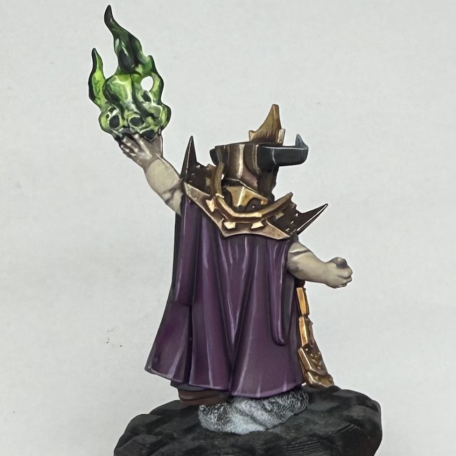
I tested out the reds on the gems of these Infernal Razers, as well as the eyes. The three colours I was sent worked really well together - I basecoated with Sangria, before glazing a highlight of cherry on. I then added an edge and glazed highlight of Cardinal, as well as white highlights and a black shadow. I was able to go back and forth and almost wet blend with some of my colours here, with the longer working time of Mini Colour coming in handy. Where I was glazing though, a quick blast with a hairdryer had the layers dry very quickly.
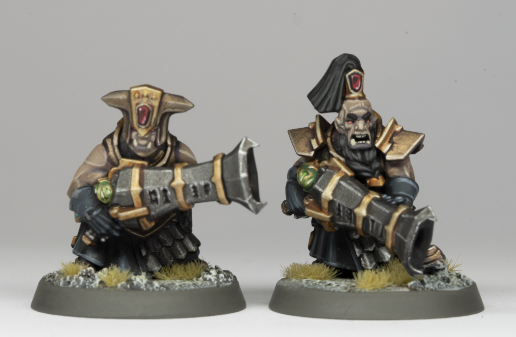 Helsmiths of Hashut Infernal Razers. Credit: Rich Nutter
Jades
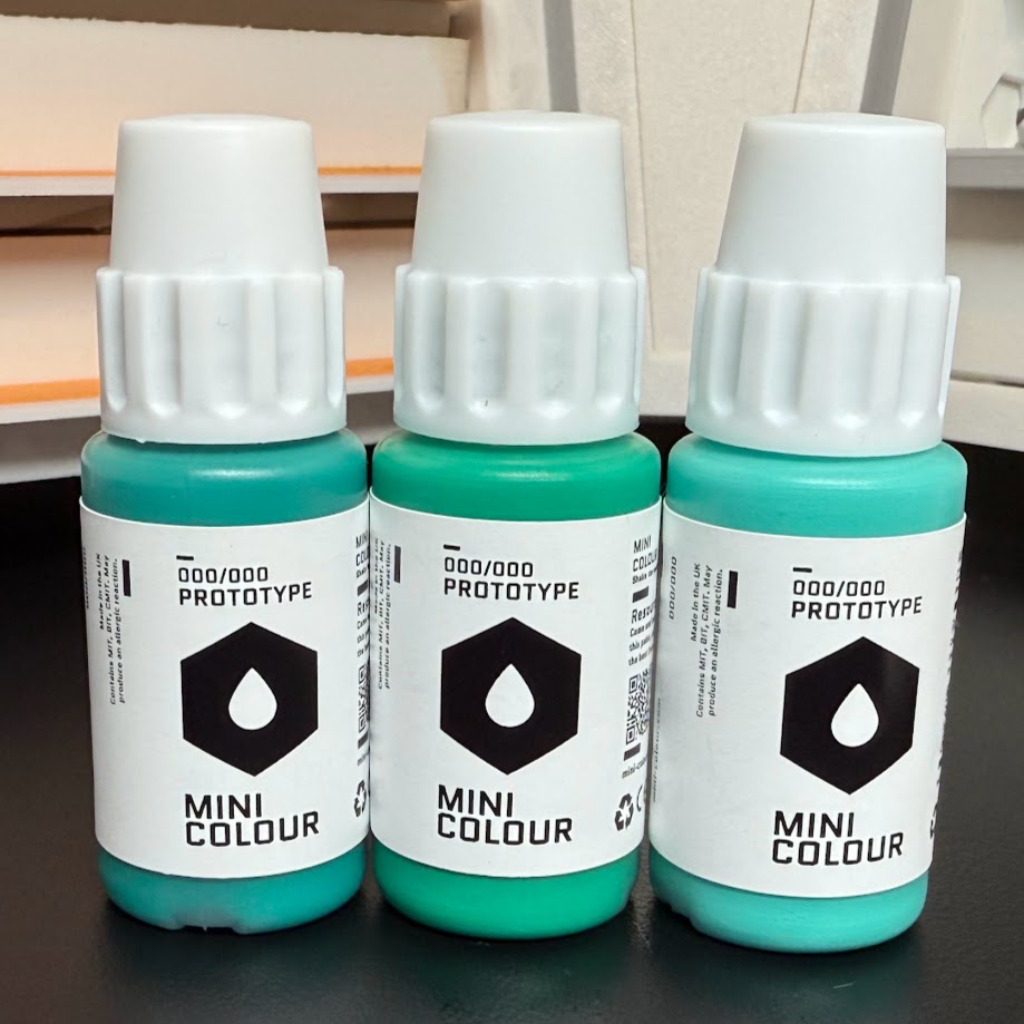 Mini Colour jade bottles. Credit: Rich Nutter
Mini Colour sent across the jade half of the Jade & Turquoise set.
 Mini Colour jades. Credit: Rich Nutter
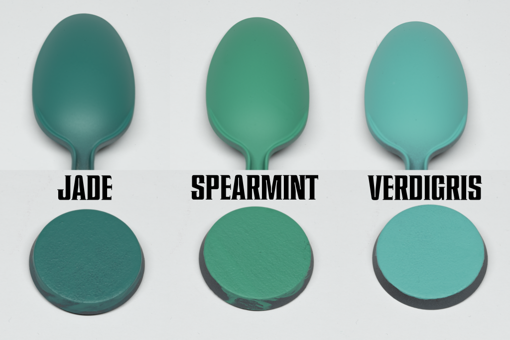
Jade:
Mini Colour jades. Credit: Rich Nutter
Jade: The platonic ideal of a jade green, it really does what it says on the tin. Surprisingly, I found that this didn’t cover quite as well as the lighter jade colours, although it was only really a matter of one or two extra coats of thinned paint. The resulting colour is great though, deep and intense. If you’re looking for a comparison, it’s about halfway between Pro-Acryl Jade and Bright Jade, and also a touch less blue.
Spearmint: The logical step up from Jade, this colour is really strong and covers very well. This is one of the standout colours of the ones I received, I can’t think of a single way I’d change it. Quite similar to Sybarite Green from Citadel, although in my opinion it’s much nicer.
Verdigris: Looking at the bottles, I thought this felt like it might not be a logical step on top of the other two jade paints here, it feels like it’s a little more blue. In use though, I found it really comes out a bit brighter than it looks in the bottle, and does go over Spearmint and Jade quite well. It also covers really surprisingly well, which I expect might be because it has quite a lot of white in it. It’s an appropriately named colour too, this would be perfect for verdigris effects. This is another one that felt more matt than others, as well.
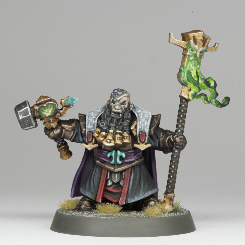
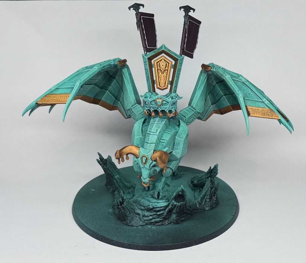
The jade paints were put to work in anger on the Ashen Elder (can you tell I've been painting a lot of Helsmiths recently?). I think they worked really well on his belt detail and the gem of his hammer - you can really see how Verdigris feels like quite a jump from Spearmint, but still works well as a highlight. I went thinner on my layers on the buckle, trying to build the highlights smoother.
 Helsmiths of Hashut Ashen Elder. Credit: Rich Nutter
I also had a go with the jades through the airbrush, building up a base colour on the Infernal Taurus.
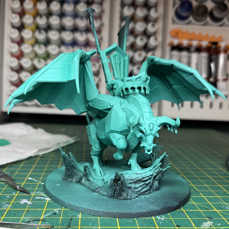 Infernal Taurus airbrushed with Mini Colour jades. Credit: Rich Nutter
This is based with Jade, before airbrushing up with targeted highlights of Spearmint and Verdigris - I think overall the Spearmint is the colour that shines through.
A later step of my painting process on the Taurus led me to change my strategy a bit, and try some stippling and drybrushing with the same colours after an all-over wash. As you can see below, the colours have gone on nicely and worked well together to give the impression of a jade marbled stone. Obviously they're going to be of limited use if you're not trying to paint something jade, but these do feel like really great paints for that use case.
 Semi-finished Infernal Taurus. Credit: Rich Nutter
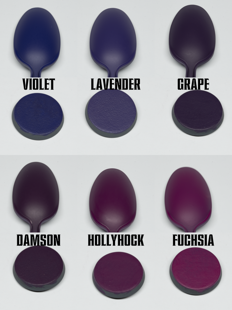
Purples
 Mini Colour purple bottles. Credit: Rich Nutter
I managed to get a look at the entire Purple set. Citadel’s Screamer Pink and Barak-Nar Burgundy are two of my favourite paints ever, so I was especially keen to see how I could replicate those using the Mini Colour range.
 Mini Colour purples. Credit: Rich Nutter
Violet:
Mini Colour purples. Credit: Rich Nutter
Violet: Wow, this is an intense colour. Amazing coverage, and a super saturated rich purple. It’s the platonic ideal of purple. I’m struggling to say anything more intelligent, it’s just really nice. It covers great too.
Lavender: Another extremely nice purple, with less blue than Violet has. It also covers nicely, and thins down well too for some shadow glazing.
Grape: Grape is dreamy, another of my favourites. It’s a good workhorse purple, close enough to Violet and Lavender to mix in or layer over for highlights, but also close enough to the other colours in the range to work as a base for them.
Damson: Damson feels like it’s about halfway between Barak-Nar Burgundy and Screamer Pink, although more pink than burgundy. It’s a really deep, rich colour, and very smooth. I did find it took quite a few layers over black to build up a solid colour, but over the grey primer of the swatches it was much more consistent. I love this colour, it’s one of my favourites and I’ll be sad as soon as my sample bottle runs out (which will be soon).
Hollyhock: This is the first paint I had a real issue with. I was using it where I might otherwise be using Screamer Pink, and found that it really, really didn’t want to cover well over black, which is a shame as it would have been a perfect basecoat. I did stick it out and get there eventually, but in the future I’d probably build it up over Grape or Damson first. The colour is fantastic, a mid-dark magenta that’s really intense. Over the grey it was less problematic, especially through the airbrush where it still felt almost as good as any of the other paints.
Fuchsia: The other paint I had an issue with, Fuchsia feels like it covers worse than Hollyhock, although that’s mitigated a bit by it being so strong that it’s probably not a colour you often want to basecoat with. It’s a super saturated bright magenta, and although I struggled to layer with it I did mix it with some white (not a Mini Colour one) and it worked really well as a highlight. Chatting to the Mini Colour guys, they’re aware that this paint and Hollyhock are perhaps not quite where they want them, and ultimately the mix might change a touch between the prototypes I was testing and the final range.
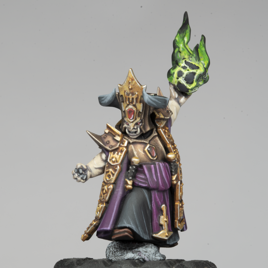 Helsmiths of Hashut Daemonsmith ready to be mounted on an Infernal Taurus. Credit: Rich Nutter
This Daemonsmith (due to be stuck to the top of that Taurus at some point) has some of the purples on her. The belt/sash is basecoated with Hollyhock, which is the slightly painful experience I described above, but the final colour is lovely. It's highlighted with Fuchsia, and then with Fuchsia mixed with white. It's shaded down with a thinned Hollyhock mixed with black - it's really great to see that these paints play well with other ranges that people may already own.
 Daemonsmith rear view of robes. Credit: Rich Nutter
The robes were basecoated in Damson to get a slightly different colour, although if I was doing it again I'd start with Plum, or maybe a Plum-Damson mix. They got a gentle shade of Damson, before mixing in some black for the deeper shade. I did some gentle glazed layers of Damson mixed with Hollyhock, which don't show up very well in the photo. The highlight is a mix of Damson, Fuchsia and White, to try and differentiate from the sash highlights. I did try some recess shading with Violet and Lavender here, but I found that they turned the tone too blue for the effect I was going for. This can be a good effect for building colour contrast, but it wouldn't have fit in with the rest of my Helsmiths, so I ultimately stuck with Grape and black.
Overall, I really enjoyed using these purples on the Helsmiths, and it was easy to adapt the paints to my existing scheme. They apply really smoothly, and the range works together well. I haven't had a chance to give Violet and Lavender a proper go on something yet, but I've got a Tyranid Lictor kill team that is begging to be painted up as Hive Fleet Leviathan with those colours on the purple carapace.
Browns
 Mini Colour brown bottles. Credit: Rich Nutter
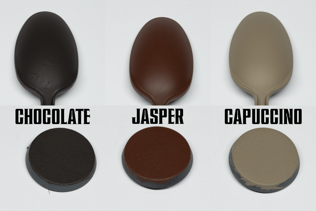
I got a spread of browns from across two sets - Chocolate and Jasper from the Warm Brown set, and Capuccino from the Cold Browns.
 Mini Colour browns. Credit: Rich Nutter
Chocolate:
Mini Colour browns. Credit: Rich Nutter
Chocolate: Fantastic. This brown is rich, dark and smooth. The obvious comparison is Citadel Rhinox Hide, although I think this comes out a bit darker and more matt than Rhinox. This was also one of the best-covering paints of the ones I tested. A real workhorse.
Jasper: A saturated orange-red brown, this is definitely around the kind of Doombull Brown/Mournfang Brown kind of area, although actually the colour it reminds me the most of is P3’s Bloodstone. That’s good news, as I always found Bloodstone to be quite a unique colour that no other range really hit. I think Jasper is actually a bit darker, but it’s a lovely colour and paints well, with great coverage.
Capuccino: Capuccino is a kind of dark bone/cream colour, or if you prefer a light, slightly yellow brown. It reminds me a lot of Citadel Morghast Bone, just a touch darker and more saturated than Ushabti Bone. Once again, it’s a pretty rich colour, especially for being comparatively light. I was expecting this to cover quite badly, or at least to be one of the range that is a touch thinner and more intended for highlights, but I was pleasantly surprised by how well it covered over the grey primer.
Helsmiths of Hashut Daemonsmith ready to be mounted on an Infernal Taurus. Credit: Rich Nutter
It's the Daemonsmith again! The browns are the paints I've had the least chance to use so far, but I did paint this lady's boots poking out from under her robe. These are based with Chocolate, and layered/chunky highlighted with Jasper. Capuccino was a bit too extreme as a jump straight from Jasper, so I mixed them 50:50 for the highlight. As you can see, they've mixed really nicely.
I also managed to basecoat the Bull Centaur's cow parts with Chocolate. As you can see, it's a lovely flat brown to work up from, and I can see Jasper getting a lot of work here as I build up to a redder cow colour.
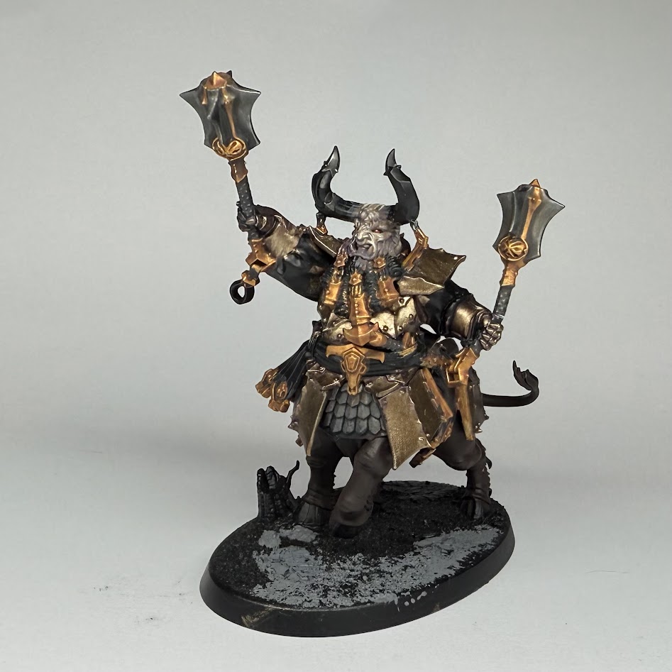 Helsmiths of Hashut Bull Centaur WIP. Credit: Rich Nutter
Final Thoughts
I’m really excited by the potential of the Mini Colour range. The idea of a range with quality of colour as its top priority, rather than range of colours or consistency of coverage, is quite novel, and I’m really pleased to say that all of the paints I tried absolutely nail this mission statement. The colours are rich, they don’t look significantly different between the bottles and the model, and they work well off a dry palette (although I’d still recommend adding a dot of water unless you’re drybrushing), diluted to a glaze, or anything in between. I had no trouble using them with brush, drybrush or airbrush, and (with a couple of exceptions, see next paragraph) they really allowed me to focus on just painting the model rather than managing my paint. I’ve used, and own, a lot of paint ranges, and every single one has at least one thing I won’t use it for. I’m not claiming (and nor are Mini Colour) that these are the only paints you’ll ever need or want, or that they are perfect, but I will say this: in my opinion, this is a really solid set of paints that is worth the money being asked for it, and it would be an asset to any painter’s collection. I received the samples for free, but I have backed the Kickstarter with my own money.
I did mention exceptions, which I’ve already covered in the relevant sections, but to bring them back in the conclusion - I was disappointed with the coverage of Hollyhock and Fuchsia from the Purple set. Hollyhock seems like a slightly brighter equivalent of Screamer Pink, but I think it must have taken around 8 coats to get a solid coverage of it, and I found Fuchsia difficult to layer with compared to the other paints in the range. Speaking to Byron, the team are aware of this, and are considering altering the pigment mix of these colours very slightly to improve the usability - ultimately the paints I have tried are still prototypes. I did also notice a tendency for the paints to dry quite unevenly if too much, or too thick a coat, of paint was applied. That’s true of a lot of paints, especially when thinned, as the longer drying time allows the pigment to float around the water/medium on the surface and settle unevenly, but I did notice it more than I expected here. Still, paint is best when applied thinly, and I was rushing to have swatches prepared for this review, so my haste might be at fault. It’s worth highlighting that I didn’t encounter this issue at all whilst using the paints on miniatures rather than flat bases and spoons.
More broadly, I do think that the educational side of the Mini Colour offering is going to be important. I’m an experienced painter and these paints were really fun to use, but I do worry that the slightly longer working time and variable coverage might trip up novice painters who might be more used to ranges where consistent one-to-two-coat coverage is prioritised. These paints really feel like they’re at their best when carefully building up thin layers of colour, whether that’s by brush, airbrush, or drybrush. Still, Cult of Paint and Artis Opus are two of the most reliable channels when it comes to effective, easy to follow tutorials, so I’m confident that Mini Colour’s accompanying education content is likely to be just as good at clearly communicating this.
If you’d like to get hold of your own set of Mini Colour paints, the Kickstarter campaign is live until November 6th 2025, and you can back it here:
Mini Colour Kickstarter
(This is an affiliate link, so Goonhammer may receive a benefit if you choose to follow it.)
If you happen to be at Spiel Essen this weekend, you can find Byron and Andy at the Artis Opus stall showing off Mini Colour and answering your questions. Head to Hall 1, Booth 1E111.
Have any questions or feedback? Drop us a note in the comments below or email us at contact@goonhammer.com. Want articles like this linked in your inbox every Monday morning? Sign up for our newsletter. And don’t forget that you can support us on Patreon for backer rewards like early video content, Administratum access, an ad-free experience on our website and more.
Thank you for being a friend.


 Goonhammer Hobby Round-Up: March 2026
 Goonhammer Reviews: Tribal Conquest
 Conquest: Weaver Courts Gemred Knights and Scaile Dancers Model Review